Jupyter Notebook#
Lecture 24: Decision Trees#

In this module we are going to test out the tree based methods we discussed in class from Chapter 8.
# Everyone's favorite standard imports
import numpy as np
import pandas as pd
import matplotlib.pyplot as plt
%matplotlib inline
import time


# ML imports we've used previously
from sklearn.model_selection import train_test_split
from sklearn.metrics import mean_squared_error
Fitting Regression Trees#
We can now turn to setting up a basic regression tree. For this example, we’re going to use the Carseat data where we will predict Sales from the rest of the columns. I’ll do a bit of cleanup for you so we can get to the good stuff.
url = "https://msu-cmse-courses.github.io/CMSE381-S26/_downloads/2cec98f7fc943558992925bc2510bb9d/Carseats.csv"
carseats = pd.read_csv(url).drop('Unnamed: 0', axis=1)
carseats.ShelveLoc = pd.factorize(carseats.ShelveLoc)[0]
carseats.Urban = carseats.Urban.map({'No':0, 'Yes':1})
carseats.US = carseats.US.map({'No':0, 'Yes':1})
carseats.info()
<class 'pandas.core.frame.DataFrame'>
RangeIndex: 400 entries, 0 to 399
Data columns (total 11 columns):
 #   Column       Non-Null Count  Dtype
---  ------       --------------  -----
 0   Sales        400 non-null    float64
 1   CompPrice    400 non-null    int64
 2   Income       400 non-null    int64
 3   Advertising  400 non-null    int64
 4   Population   400 non-null    int64
 5   Price        400 non-null    int64
 6   ShelveLoc    400 non-null    int64
 7   Age          400 non-null    int64
 8   Education    400 non-null    int64
 9   Urban        400 non-null    int64
 10  US           400 non-null    int64
dtypes: float64(1), int64(10)
memory usage: 34.5 KB
carseats.head()
| Sales | CompPrice | Income | Advertising | Population | Price | ShelveLoc | Age | Education | Urban | US | |
|---|---|---|---|---|---|---|---|---|---|---|---|
| 0 | 9.50 | 138 | 73 | 11 | 276 | 120 | 0 | 42 | 17 | 1 | 1 |
| 1 | 11.22 | 111 | 48 | 16 | 260 | 83 | 1 | 65 | 10 | 1 | 1 |
| 2 | 10.06 | 113 | 35 | 10 | 269 | 80 | 2 | 59 | 12 | 1 | 1 |
| 3 | 7.40 | 117 | 100 | 4 | 466 | 97 | 2 | 55 | 14 | 1 | 1 |
| 4 | 4.15 | 141 | 64 | 3 | 340 | 128 | 0 | 38 | 13 | 1 | 0 |
X = carseats.drop(['Sales'], axis = 1)
y = carseats.Sales
X.head()
| CompPrice | Income | Advertising | Population | Price | ShelveLoc | Age | Education | Urban | US | |
|---|---|---|---|---|---|---|---|---|---|---|
| 0 | 138 | 73 | 11 | 276 | 120 | 0 | 42 | 17 | 1 | 1 |
| 1 | 111 | 48 | 16 | 260 | 83 | 1 | 65 | 10 | 1 | 1 |
| 2 | 113 | 35 | 10 | 269 | 80 | 2 | 59 | 12 | 1 | 1 |
| 3 | 117 | 100 | 4 | 466 | 97 | 2 | 55 | 14 | 1 | 1 |
| 4 | 141 | 64 | 3 | 340 | 128 | 0 | 38 | 13 | 1 | 0 |
The regression tree function we will use is DecisionTreeRegressor.
from sklearn import tree
from sklearn.tree import DecisionTreeRegressor
reg_tree = DecisionTreeRegressor(max_depth = 3)
reg_tree.fit(X,y)
DecisionTreeRegressor(max_depth=3)In a Jupyter environment, please rerun this cell to show the HTML representation or trust the notebook.
On GitHub, the HTML representation is unable to render, please try loading this page with nbviewer.org.
Parameters
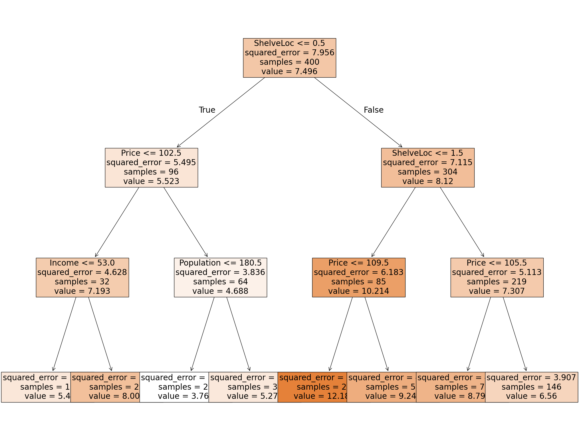
We can draw the resulting tree to visualize what’s happening.
Visualization 1: Text based#
Ok, so not the prettiest of the options, but at least this one will work. This provides a text based tree where I can figure out what decisions were made at each step.
X.columns
Index(['CompPrice', 'Income', 'Advertising', 'Population', 'Price',
       'ShelveLoc', 'Age', 'Education', 'Urban', 'US'],
      dtype='object')
print( tree.export_text(reg_tree, feature_names = list(X.columns)) )
|--- ShelveLoc <= 0.50
|   |--- Price <= 102.50
|   |   |--- Income <= 53.00
|   |   |   |--- value: [5.40]
|   |   |--- Income >  53.00
|   |   |   |--- value: [8.01]
|   |--- Price >  102.50
|   |   |--- Population <= 180.50
|   |   |   |--- value: [3.77]
|   |   |--- Population >  180.50
|   |   |   |--- value: [5.28]
|--- ShelveLoc >  0.50
|   |--- ShelveLoc <= 1.50
|   |   |--- Price <= 109.50
|   |   |   |--- value: [12.19]
|   |   |--- Price >  109.50
|   |   |   |--- value: [9.24]
|   |--- ShelveLoc >  1.50
|   |   |--- Price <= 105.50
|   |   |   |--- value: [8.80]
|   |   |--- Price >  105.50
|   |   |   |--- value: [6.56]
✅ Do this: Given a new data point with the entries below, use the visualization to determine the choices made by the decision tree at each step? What will your decision tree predict for Sales?
CompPrice      117
Income         100
Advertising      4
Population     466
Price           97
ShelveLoc        2
Age             55
Education       14
Urban            1
US               1
Your answer here
Visualization 2: Probably should work#
Here’s another option for visualization. There is a plotting function built into sklearn.tree but I’ve had issues with people’s python versions before. Let’s try it and see, it’s a bit clunky but it gets the job done.
fig = plt.figure(figsize = (25,20))
_= tree.plot_tree(reg_tree, feature_names = X.columns,
               filled = True,
              fontsize = 20)
plt.show()
✅ Do this: Given a new data point with the following entries, use the visualization to determine the choices made by the decision tree at each step? What will your decision tree predict for Sales?
CompPrice      141
Income          64
Advertising      3
Population     340
Price          128
ShelveLoc        0
Age             38
Education       13
Urban            1
US               0
Your answer here
Other visualization tools.#
There are nicer visualization tools. In particular, the outputs requiring graphviz are quite a bit better than these options. However, installing graphviz is non trivial so we won’t use it in this lecture. Examples of code using this can be found here.
Predicting on the tree.#
As with all other sklearn packages we’ve seen, we can predict values on our input X matrix, and compare the results using MSE.
yhat = reg_tree.predict(X)
yhat[:5]
array([ 5.27820513, 12.18785714, 8.79890411, 8.79890411, 5.27820513])
✅ Do this: Use the regression tree you just built to predict the Sales value for the test set.
Check your answers from above. The first data point example was the third row of
X; the second data point example was the fourth row. Do you get the same answer from the prediction as by hand with the visualization?What is the resulting MSE on the full data set?
# Your code here #

Great, you got to here! Hang out for a bit, there’s more lecture before we go on to the next portion.
Classification trees#
Loading in the data#
Let’s start with the palmerPenguins data set.
pip install palmerpenguins
Requirement already satisfied: palmerpenguins in /Users/bao/anaconda3/lib/python3.11/site-packages (0.1.6)
Requirement already satisfied: pandas in /Users/bao/anaconda3/lib/python3.11/site-packages (from palmerpenguins) (2.0.3)
Requirement already satisfied: numpy in /Users/bao/anaconda3/lib/python3.11/site-packages (from palmerpenguins) (1.26.4)
Requirement already satisfied: python-dateutil>=2.8.2 in /Users/bao/anaconda3/lib/python3.11/site-packages (from pandas->palmerpenguins) (2.8.2)
Requirement already satisfied: pytz>=2020.1 in /Users/bao/anaconda3/lib/python3.11/site-packages (from pandas->palmerpenguins) (2023.3.post1)
Requirement already satisfied: tzdata>=2022.1 in /Users/bao/anaconda3/lib/python3.11/site-packages (from pandas->palmerpenguins) (2023.3)
Requirement already satisfied: six>=1.5 in /Users/bao/anaconda3/lib/python3.11/site-packages (from python-dateutil>=2.8.2->pandas->palmerpenguins) (1.16.0)
Note: you may need to restart the kernel to use updated packages.
import palmerpenguins
penguins_df = palmerpenguins.load_penguins()

#I'm shuffling the data to make this a bit more interesting
penguins_df = penguins_df.sample(frac=1, random_state=1236)

penguins_df = penguins_df.dropna()
penguins_df.head()
| species | island | bill_length_mm | bill_depth_mm | flipper_length_mm | body_mass_g | sex | year | |
|---|---|---|---|---|---|---|---|---|
| 259 | Gentoo | Biscoe | 53.4 | 15.8 | 219.0 | 5500.0 | male | 2009 |
| 265 | Gentoo | Biscoe | 51.5 | 16.3 | 230.0 | 5500.0 | male | 2009 |
| 50 | Adelie | Biscoe | 39.6 | 17.7 | 186.0 | 3500.0 | female | 2008 |
| 290 | Chinstrap | Dream | 45.9 | 17.1 | 190.0 | 3575.0 | female | 2007 |
| 187 | Gentoo | Biscoe | 48.4 | 16.3 | 220.0 | 5400.0 | male | 2008 |
X_df = pd.get_dummies(penguins_df.drop(columns = ['species']), drop_first = True)
X_df.head()
| bill_length_mm | bill_depth_mm | flipper_length_mm | body_mass_g | year | island_Dream | island_Torgersen | sex_male | |
|---|---|---|---|---|---|---|---|---|
| 259 | 53.4 | 15.8 | 219.0 | 5500.0 | 2009 | False | False | True |
| 265 | 51.5 | 16.3 | 230.0 | 5500.0 | 2009 | False | False | True |
| 50 | 39.6 | 17.7 | 186.0 | 3500.0 | 2008 | False | False | False |
| 290 | 45.9 | 17.1 | 190.0 | 3575.0 | 2007 | True | False | False |
| 187 | 48.4 | 16.3 | 220.0 | 5400.0 | 2008 | False | False | True |
y_df = penguins_df.species
y_df
259       Gentoo
265       Gentoo
50        Adelie
290    Chinstrap
187       Gentoo
         ...
56        Adelie
28        Adelie
337    Chinstrap
331    Chinstrap
35        Adelie
Name: species, Length: 333, dtype: object
Fitting Classification Trees#
We’ll use sklearn’s built in modules for this. As always, the user guide is an excellent place to get started.
Now to fit the decision tree classifier? All we need is two lines:
from sklearn import tree
clf_tree = tree.DecisionTreeClassifier(max_depth = 3)
clf_tree = clf_tree.fit(X_df, y_df)
✅ Do this: Using the .predict function, what is the species predicted for the first five data points in X? Which of these predicted values are the same as the original labels?
# Your code here
✅ Do this: Use whichever visualization method you prefer from above to see the resulting tree. What is the sequence of decisions for predicting the first data point?
###YOUR CODE FOR VISUALIZATION###
✅ Do this: What is the sequence of decisions for predicting the first data point based on the visualization?
###First data point###
X_df.iloc[0,:]
bill_length_mm         53.4
bill_depth_mm          15.8
flipper_length_mm     219.0
body_mass_g          5500.0
year                   2009
island_Dream          False
island_Torgersen      False
sex_male               True
Name: 259, dtype: object
#YOUR ANSWER HERE###
Pruning the tree#
The simplest method we have for pruning the tree is to limit the maximum depth, that is the number of times the tree is allowed to split.
✅ Do this: Change the value of max_depth below to see how the resulting tree changes.
clf_tree = tree.DecisionTreeClassifier(max_depth =10) #<-- mess with this


clf_tree = clf_tree.fit(X_df, y_df)
fig = plt.figure(figsize = (25,20))
_= tree.plot_tree(clf_tree, feature_names = X_df.columns,
               filled = True,
              fontsize = 20)

plt.show()
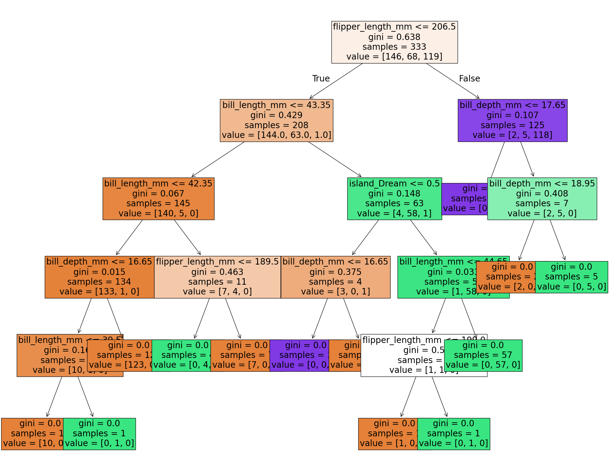
If you are interested in more complex pruning techniques like we discussed in class, you can try to mess around with Minimal Cost-Complexity Pruning, but I’ll leave that for another day.
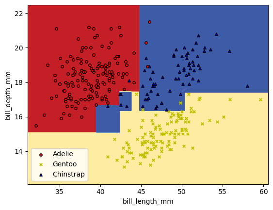
Visualizing the parameter splits#
Now, if we want to visualize the parameter splits that are being represented with the trees, we can do that. However, I can’t (easily) draw these sorts of figures when I’m using more than two variables. Let’s just grab the first two variables and build a classifer off of those.
X_pair = X_df[['bill_length_mm', 'bill_depth_mm']].values
y_pair = y_df

clf_pair = tree.DecisionTreeClassifier(max_depth = 5).fit(X_pair, y_df)
✅ Do this: Use whatever worked for you above to plot your decision tree.
# Your code here #
✅ Do this: Below is some code that will draw the regions of parameter space that get each different prediction.
Which labels do the colors red, yellow, and blue match to?
What split in the figure does the first split in your tree above correspond to?
What changes in this figure if you change the
max_depthin your tree model above?
# Bounds for the figure
X = X_df.values
x0_min = X[:,0].min()-1
x0_max = X[:,0].max()+1
x1_min = X[:,1].min()-1
x1_max = X[:,1].max()+1

# Parameters
n_classes = 3
plot_colors = "ryb"
plot_step = 0.02

xx, yy = np.meshgrid(
    np.arange(x0_min, x0_max, plot_step), np.arange(x1_min, x1_max, plot_step)
)
plt.tight_layout(h_pad=0.5, w_pad=0.5, pad=2.5)

Z = clf_pair.predict(np.c_[xx.ravel(), yy.ravel()])
def numReplace(label):
    if label == 'Adelie':
        return 0
    if label == 'Gentoo':
        return 1
    else: #(if 'Chinstrap')
        return 2
Z = np.array([numReplace(label) for label in Z])
# Z = Z.replace(['Adelie','Gentoo','Chinstrap'], [0,1,2])
Z = Z.reshape(xx.shape)
cs = plt.contourf(xx, yy, Z, cmap=plt.cm.RdYlBu)

plt.xlabel(X_df.columns[0])
plt.ylabel(X_df.columns[1])

# Plot the training points
for label, color, symbol in zip(['Adelie','Gentoo','Chinstrap'], plot_colors, ['o','x','^']):
    idx = np.where(y_df == label)
    plt.scatter(
        X[idx, 0],
        X[idx, 1],
        c=color,
        label=label,
        edgecolor="black",
        s=15,
        marker=symbol,
    )
plt.legend()
plt.show()
/var/folders/gh/l0sfqccj5klgx53jvc9kt11h0000gn/T/ipykernel_18390/4035450864.py:37: UserWarning: You passed a edgecolor/edgecolors ('black') for an unfilled marker ('x').  Matplotlib is ignoring the edgecolor in favor of the facecolor.  This behavior may change in the future.
  plt.scatter(
Congratulations, we’re done!#
Initially created by Dr. Liz Munch, modified by Dr. Lianzhang Bao and Dr. Firas Khasawneh, Michigan State University

This work is licensed under a Creative Commons Attribution-NonCommercial 4.0 International License.