Jupyter - Day 23 - Section 001#
Lecture 23: More Cubic Splines#
In this module we are going to implement cubic splines
# Everyone's favorite standard imports
import numpy as np
import pandas as pd
import matplotlib.pyplot as plt
%matplotlib inline
import time


# ML imports we've used previously
from sklearn.model_selection import train_test_split
from sklearn.metrics import mean_squared_error
from sklearn.linear_model import LinearRegression
Loading in the data#
We’re going to use the Wage data used in the book, so note that many of your plots can be checked by looking at figures in the book.
url = "https://msu-cmse-courses.github.io/CMSE381-S26/_downloads/2d664388c56e51af2d83cea1fe3027f4/Wage.csv"
df = pd.read_csv(url, index_col =0 )
df.head()
| year | age | sex | maritl | race | education | region | jobclass | health | health_ins | logwage | wage | |
|---|---|---|---|---|---|---|---|---|---|---|---|---|
| 231655 | 2006 | 18 | 1. Male | 1. Never Married | 1. White | 1. < HS Grad | 2. Middle Atlantic | 1. Industrial | 1. <=Good | 2. No | 4.318063 | 75.043154 |
| 86582 | 2004 | 24 | 1. Male | 1. Never Married | 1. White | 4. College Grad | 2. Middle Atlantic | 2. Information | 2. >=Very Good | 2. No | 4.255273 | 70.476020 |
| 161300 | 2003 | 45 | 1. Male | 2. Married | 1. White | 3. Some College | 2. Middle Atlantic | 1. Industrial | 1. <=Good | 1. Yes | 4.875061 | 130.982177 |
| 155159 | 2003 | 43 | 1. Male | 2. Married | 3. Asian | 4. College Grad | 2. Middle Atlantic | 2. Information | 2. >=Very Good | 1. Yes | 5.041393 | 154.685293 |
| 11443 | 2005 | 50 | 1. Male | 4. Divorced | 1. White | 2. HS Grad | 2. Middle Atlantic | 2. Information | 1. <=Good | 1. Yes | 4.318063 | 75.043154 |
df.info()
<class 'pandas.core.frame.DataFrame'>
Index: 3000 entries, 231655 to 453557
Data columns (total 12 columns):
 #   Column      Non-Null Count  Dtype
---  ------      --------------  -----
 0   year        3000 non-null   int64
 1   age         3000 non-null   int64
 2   sex         3000 non-null   object
 3   maritl      3000 non-null   object
 4   race        3000 non-null   object
 5   education   3000 non-null   object
 6   region      3000 non-null   object
 7   jobclass    3000 non-null   object
 8   health      3000 non-null   object
 9   health_ins  3000 non-null   object
 10  logwage     3000 non-null   float64
 11  wage        3000 non-null   float64
dtypes: float64(2), int64(2), object(8)
memory usage: 304.7+ KB
df.describe()
| year | age | logwage | wage | |
|---|---|---|---|---|
| count | 3000.000000 | 3000.000000 | 3000.000000 | 3000.000000 |
| mean | 2005.791000 | 42.414667 | 4.653905 | 111.703608 |
| std | 2.026167 | 11.542406 | 0.351753 | 41.728595 |
| min | 2003.000000 | 18.000000 | 3.000000 | 20.085537 |
| 25% | 2004.000000 | 33.750000 | 4.447158 | 85.383940 |
| 50% | 2006.000000 | 42.000000 | 4.653213 | 104.921507 |
| 75% | 2008.000000 | 51.000000 | 4.857332 | 128.680488 |
| max | 2009.000000 | 80.000000 | 5.763128 | 318.342430 |
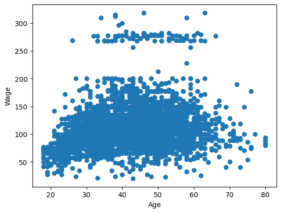
Here’s the plot we used multiple times in class to look at a single variable: age vs wage
plt.scatter(df.age,df.wage)
plt.xlabel('Age')
plt.ylabel('Wage')
plt.show()
1. Splines#
Before we get to the wage dataset, we’ll build some simpler spline models. Let’s start by playing with some toy data, making heavy use of the examples provided on the scikitlearn spline page.
# Note: this bit is going to use some packages that are newly
# provided in sklearn 1.0.  If you're having issues, try uncommenting
# and running the update line below.
# %pip install --upgrade scikit-learn
from sklearn.preprocessing import SplineTransformer
from sklearn.pipeline import make_pipeline
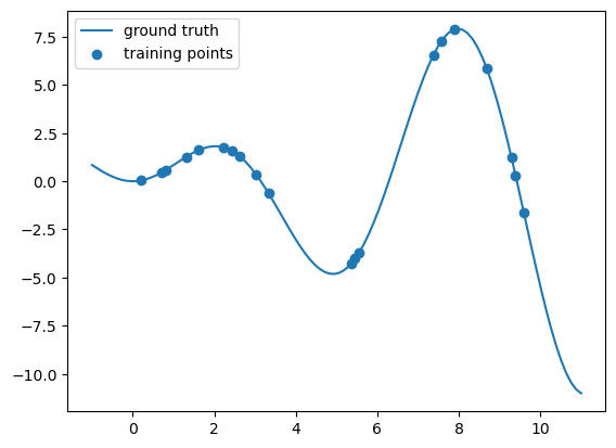
# This code block is going to make us some nasty fake data
# to try to find some sort of interpolation.

def f(x):
    """Function to be approximated by polynomial interpolation."""
    return x * np.sin(x)


# whole range we want to plot
x_plot = np.linspace(-1, 11, 100)
y_plot = f(x_plot)


# Make some data.  Provide a small amount of points to make
# our polynomials all kinds of wiggly.
X = np.linspace(0, 10, 100)
rng = np.random.RandomState(0)
X = np.sort(rng.choice(X, size=20, replace=False))
y = f(X)

# # create 2D-array versions of these arrays to feed to transformers
# X_train = x_train[:, np.newaxis]
# X = X[:, np.newaxis]

X = X.reshape(-1,1)
y = y.reshape(-1,1)


#====ploting======

# plot function
plt.plot(x_plot, y_plot,label="ground truth")

# plot training points
plt.scatter(X, y, label="training points")

plt.legend()

plt.show()
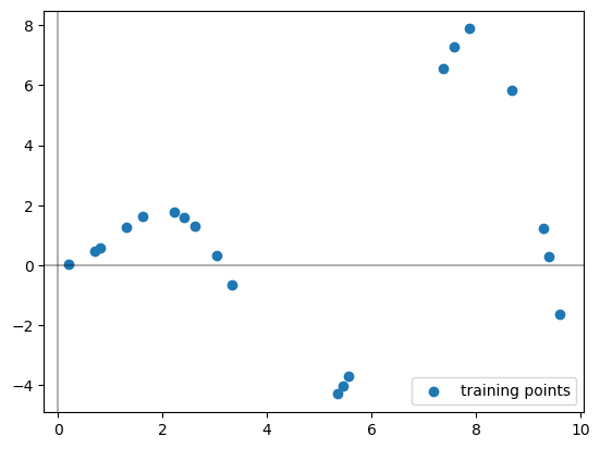
Let’s pretend you never saw that \(f\) function I used to build the data, you’re just handed these scattered data points and asked to learn a piecewise polynomial that fits it.
# plot training points
plt.scatter(X, y, label="training points")

# Plots the axes
plt.axhline(0, color="black", alpha=0.3)
plt.axvline(0, color="black", alpha=0.3)

plt.legend()
plt.show()
The SplineTransformer sets up our basis functions for us. These are the functions that we are learning coefficients for when we are doing regression.
# This sets up the spline transformer. The fit command is deciding where to put the knots
splt = SplineTransformer(n_knots=4, degree=3).fit(X)

print('The knots:')
print(splt.bsplines_[0].t)


#----Visualizing the knots-----#
# Plots the axes
plt.axhline(0, color="black", alpha=0.3)
plt.axvline(0, color="black", alpha=0.3)
# plots the original points
plt.scatter(X, y, label="training points")
# Marks where the knots are as vertical lines
knots = splt.bsplines_[0].t
plt.vlines(knots[3:-3], ymin=-4, ymax=8, linestyles="dashed")

# Uncomment below if you want to see ALL the knots, see note below.
plt.vlines(knots, ymin=-4, ymax=8, linestyles="dashed")

plt.show()
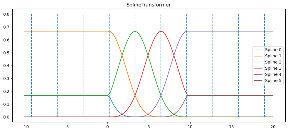
The knots:
[-9.19191919 -6.06060606 -2.92929293  0.2020202   3.33333333  6.46464646
  9.5959596  12.72727273 15.85858586 18.98989899]
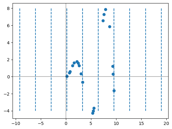
Note that I am only drawing the middle 4 knots here. The SplineTransformer actually hands back several extra knots on either side of the input data points for technical reasons.
Next, we can peek at the basis function’s its using based on the chosen knots. Note that we haven’t actually learned any coefficients for the functions yet, we’re just setting up what the functions are.
Warning: The sklearn code uses a different collection of basis functions to get cubic splines. For our purposes, it doesn’t matter. We just need this thing to pop out a smooth function which it will do (at least inside the middle 4 knots)
x_plot = np.linspace(-10, 20, 100)

plt.figure(figsize=(12,5))
ax = plt.gca()

ax.plot(x_plot, splt.transform(x_plot.reshape(-1,1)))
ax.legend(ax.lines, [f"Spline {n}" for n in range(6)])
ax.set_title("SplineTransformer")

# plot knots of spline
knots = splt.bsplines_[0].t
ax.vlines(knots, ymin=0, ymax=0.8, linestyles="dashed")

plt.show()
I’m going to make use of a nice function from scikitlearn that builds up a pipeline for us to use. Basically, the make_pipline function here takes your input data, runs the SplineTransformer on it to get the features, then runs linear regression.
# B-spline with 4 + 3 - 1 = 6 basis functions
model = make_pipeline(SplineTransformer(n_knots=4, degree=3), LinearRegression())
model.fit(X, y)
Pipeline(steps=[('splinetransformer', SplineTransformer(n_knots=4)),
                ('linearregression', LinearRegression())])
In a Jupyter environment, please rerun this cell to show the HTML representation or trust the notebook. On GitHub, the HTML representation is unable to render, please try loading this page with nbviewer.org.
Parameters
Parameters
Parameters
Now, I can see the coefficients that linear regression learned by digging into the make_pipeline object as follows.
model.named_steps['linearregression'].intercept_
array([-21.99825867])
model.named_steps['linearregression'].coef_
array([[  -0.48385244,   26.71804256,   22.23314294,   13.06209193,
          53.89499213, -115.42441711]])
Similarly, I can find the knots as follows.
# Marks where the knots are as vertical lines
knots = model.named_steps['splinetransformer'].bsplines_[0].t
print(knots)
[-9.19191919 -6.06060606 -2.92929293  0.2020202   3.33333333  6.46464646
  9.5959596  12.72727273 15.85858586 18.98989899]
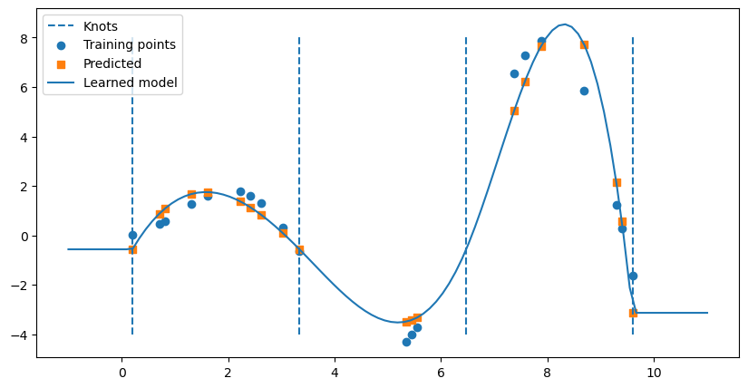
So each of the coefficients were learned for each of the spline functions drawn in the figure above. While we could try to determine the function by hand, that’s getting beyond messy. However, as usual, we can figure out the predicted values from the learned model on the original \(X\) input data as follows.
y_hat = model.predict(X)
We can also draw the full function below by using the predict function on evenly spaced \(t\) values.
# Make the figure drawn wide
plt.figure(figsize = (10,5))

# Draw knots
plt.vlines(knots[3:-3], ymin=-4, ymax=8, linestyles="dashed", label = 'Knots')

# plot training points
plt.scatter(X, y, label="Training points")

# Plot predicted values for each X
plt.scatter(X,y_hat,label = 'Predicted',marker = 's')


# Plot the full model
x_plot = np.linspace(-1, 11, 100)
spline_y_plot = model.predict(x_plot.reshape(-1,1))
plt.plot(x_plot,spline_y_plot, label = 'Learned model')

plt.legend()
plt.show()
2. Cubic spline on age to predict wage#
✅ Do this:
Split the
wageandagedata into a train test split.Using the code above that generates splines, build a cubic spline model to predict wage from age in the
Wagedata set and train on your training set.
Note we’re only doing regular splines with this code, not natural as in Fig 7.4, but the results end up pretty similar in our case
# Your code here #
##ANSWER##

X = np.array(df.age).reshape(-1,1)
y = np.array(df.wage).reshape(-1,1)

X_train, X_test, y_train, y_test = train_test_split(X,y, test_size = .1)


model = make_pipeline(SplineTransformer(n_knots=4, degree=3), LinearRegression())
model.fit(X_train,y_train)
Pipeline(steps=[('splinetransformer', SplineTransformer(n_knots=4)),
                ('linearregression', LinearRegression())])
In a Jupyter environment, please rerun this cell to show the HTML representation or trust the notebook. On GitHub, the HTML representation is unable to render, please try loading this page with nbviewer.org.
Parameters
Parameters
Parameters
✅ Do this:
Use the trained model to predict on your testing set. What is the MSE?
###YOUR CODE HERE###
##ANSWER##
# MSE

yhat= model.predict(X_test)
mean_squared_error(yhat,y_test)
1210.0460178598091
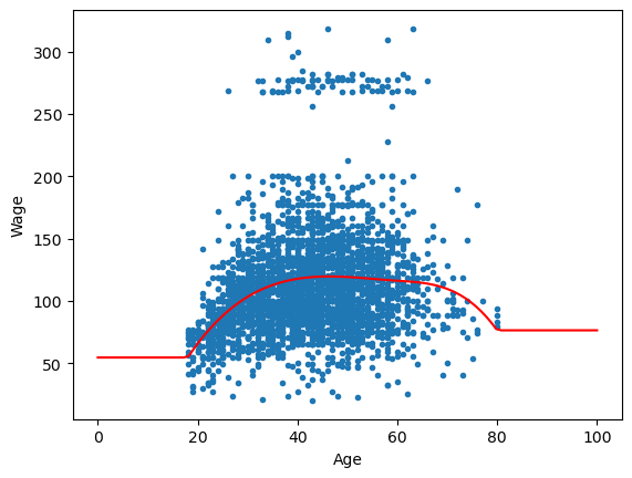
✅ Do this:
Use your trained model to draw the learned spline on the scatter plot of age and wage, as in the left side of Fig 7.5. Remember we can always do this by predicting from our model on a linear spacing of x-axis values that we want.
##ANSWER##
t = np.linspace(0, 100, 100)

plt.scatter(df.age,df.wage,marker = '.')
y_spline = model.predict(t.reshape(-1,1))
plt.plot(t,y_spline,color = 'red')
plt.xlabel('Age')
plt.ylabel('Wage')

plt.show()
Congratulations, we’re done!#
Initially created by Dr. Liz Munch, modified by Dr. Lianzhang Bao and Dr. Firas Khasawneh, Michigan State University

This work is licensed under a Creative Commons Attribution-NonCommercial 4.0 International License.
##ANSWER##
#This cell runs the converter which removes ANSWER fields, renames the notebook and cleans out output fields.

from jupyterinstruct import InstructorNotebook
import os
this_notebook = os.path.basename(globals()['__vsc_ipynb_file__'])

studentnotebook = InstructorNotebook.makestudent(this_notebook)

InstructorNotebook.validate(studentnotebook)
---------------------------------------------------------------------------
ModuleNotFoundError                       Traceback (most recent call last)
Cell In[23], line 4
      1 ##ANSWER##
      2 #This cell runs the converter which removes ANSWER fields, renames the notebook and cleans out output fields.
----> 4 from jupyterinstruct import InstructorNotebook
      5 import os
      6 this_notebook = os.path.basename(globals()['__vsc_ipynb_file__'])

ModuleNotFoundError: No module named 'jupyterinstruct'