Jupyter Notebook#
Lecture 19 - PCA#
# Everyone's favorite standard imports
import numpy as np
import pandas as pd
import matplotlib.pyplot as plt
%matplotlib inline
import time

import seaborn as sns

# ML imports we've used previously
from sklearn.model_selection import train_test_split
from sklearn.metrics import mean_squared_error
1. PCA on Penguins#

Artwork by @allison_horst
For this lab, we are going to again use the Palmer Penguins data set by Allison Horst, Alison Hill, and Kristen Gorman. You should have done this in a previous notebook, but if you don’t have the package installed to get the data, you can run
pip install palmerpenguins
to have access to the data.
from palmerpenguins import load_penguins
penguins = load_penguins()
penguins = penguins.dropna()

#Shuffle the data
# penguins = penguins.sample(frac=1)
penguins.head()
| species | island | bill_length_mm | bill_depth_mm | flipper_length_mm | body_mass_g | sex | year | |
|---|---|---|---|---|---|---|---|---|
| 0 | Adelie | Torgersen | 39.1 | 18.7 | 181.0 | 3750.0 | male | 2007 |
| 1 | Adelie | Torgersen | 39.5 | 17.4 | 186.0 | 3800.0 | female | 2007 |
| 2 | Adelie | Torgersen | 40.3 | 18.0 | 195.0 | 3250.0 | female | 2007 |
| 4 | Adelie | Torgersen | 36.7 | 19.3 | 193.0 | 3450.0 | female | 2007 |
| 5 | Adelie | Torgersen | 39.3 | 20.6 | 190.0 | 3650.0 | male | 2007 |
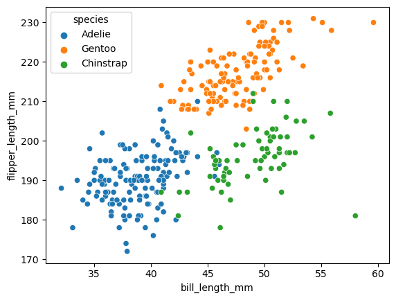
Before we get to the full version, let’s just take a look at two of the columns: flipper length and bill length. A nice thing we can do is to also color the data by which species label the data point has.
sns.scatterplot(x = penguins.bill_length_mm,
                y = penguins.flipper_length_mm,
                hue = penguins.species)
<Axes: xlabel='bill_length_mm', ylabel='flipper_length_mm'>
Before we get to it, we’re going to just work with the columns that are numeric.
penguins_num = penguins.select_dtypes(np.number)
penguins_num.head()
| bill_length_mm | bill_depth_mm | flipper_length_mm | body_mass_g | year | |
|---|---|---|---|---|---|
| 0 | 39.1 | 18.7 | 181.0 | 3750.0 | 2007 |
| 1 | 39.5 | 17.4 | 186.0 | 3800.0 | 2007 |
| 2 | 40.3 | 18.0 | 195.0 | 3250.0 | 2007 |
| 4 | 36.7 | 19.3 | 193.0 | 3450.0 | 2007 |
| 5 | 39.3 | 20.6 | 190.0 | 3650.0 | 2007 |
We will also use mean centered data to make the visualization easier (meaning shifting our data to have mean 0 in every column, and have standard deviation 1).
p_normalized = (penguins_num - penguins_num.mean())/penguins_num.std()
p_normalized.head()
| bill_length_mm | bill_depth_mm | flipper_length_mm | body_mass_g | year | |
|---|---|---|---|---|---|
| 0 | -0.894695 | 0.779559 | -1.424608 | -0.567621 | -1.281813 |
| 1 | -0.821552 | 0.119404 | -1.067867 | -0.505525 | -1.281813 |
| 2 | -0.675264 | 0.424091 | -0.425733 | -1.188572 | -1.281813 |
| 4 | -1.333559 | 1.084246 | -0.568429 | -0.940192 | -1.281813 |
| 5 | -0.858123 | 1.744400 | -0.782474 | -0.691811 | -1.281813 |
PCA with just two input columns#
To try to draw pictures similar to what we just saw on the slides, we’ll first focus on two of the columns.
penguins_subset2 = p_normalized[['bill_length_mm', 'flipper_length_mm']]
penguins_subset2
| bill_length_mm | flipper_length_mm | |
|---|---|---|
| 0 | -0.894695 | -1.424608 |
| 1 | -0.821552 | -1.067867 |
| 2 | -0.675264 | -0.425733 |
| 4 | -1.333559 | -0.568429 |
| 5 | -0.858123 | -0.782474 |
| ... | ... | ... |
| 339 | 2.159064 | 0.430446 |
| 340 | -0.090112 | 0.073705 |
| 341 | 1.025333 | -0.568429 |
| 342 | 1.244765 | 0.644491 |
| 343 | 1.135049 | -0.211688 |
333 rows × 2 columns
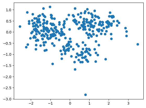
We run PCA using the PCA command from scikitlearn.
from sklearn.decomposition import PCA
# Set up the PCA object
pca = PCA(n_components=2)

# Fit it using our data
pca.fit(penguins_subset2.values)
PCA(n_components=2)In a Jupyter environment, please rerun this cell to show the HTML representation or trust the notebook.
On GitHub, the HTML representation is unable to render, please try loading this page with nbviewer.org.
Parameters
pca_df = pca.fit_transform(penguins_subset2.values)
plt.scatter(pca_df[:,0], pca_df[:,1])
<matplotlib.collections.PathCollection at 0x169904110>
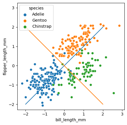
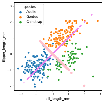
The pca.components_ store information about the lines we are going to project our data onto. Specifically, each row gives us one of these lines.
pca.components_
array([[ 0.70710678,  0.70710678],
       [-0.70710678,  0.70710678]])
sns.scatterplot(data = penguins_subset2,
                x = 'bill_length_mm',
                y = 'flipper_length_mm',
                hue = penguins.species)

for i, comp in enumerate(pca.components_):
    slope = comp[1]/comp[0]
    plt.plot(np.array([-2,2]), slope*np.array([-2,2]))

plt.axis('square')
(-2.4261469084390352,
 3.105364257468495,
 -2.2772189966421617,
 3.254292169265369)
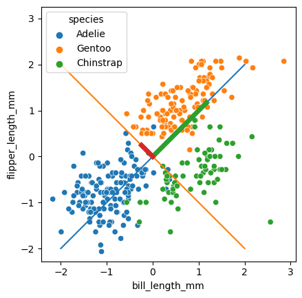
A common way to look at the relative importance of the PC’s is to draw these components as vectors with length based on the explained variance.
pca.explained_variance_
array([1.65309564, 0.34690436])
sns.scatterplot(data = penguins_subset2,
                x = 'bill_length_mm',
                y = 'flipper_length_mm',
                hue = penguins.species)

for i, (comp, var) in enumerate(zip(pca.components_, pca.explained_variance_)):
    slope = comp[1]/comp[0]
    plt.plot(np.array([-2,2]), slope*np.array([-2,2]))

    comp = comp * var  # scale component by its variance explanation power
    plt.plot(
        [0, comp[0]],
        [0, comp[1]],
        label=f"Component {i}",
        linewidth=5,
        color=f"C{i + 2}",
    )

plt.axis('square')
(-2.4261469084390352,
 3.105364257468495,
 -2.2772189966421617,
 3.254292169265369)
The next important part are the PC’s, which we can get from the pca object as follows. I’m going to put them in a dataframe to make drawing and visualization easier. Basically, \(PC_1\) is our \(Z_1\) in the slides, and \(PC_2\) is the \(Z_2\).
# The transform function takes in bill,flipper data points,
# and returns a PC1,PC2 coordinate for each one.
penguins_pca = pca.fit_transform(penguins_subset2)
penguins_pca = pd.DataFrame(data = penguins_pca, columns = ['PC1', 'PC2'])
penguins_pca.shape
(333, 2)
penguins.species
0         Adelie
1         Adelie
2         Adelie
4         Adelie
5         Adelie
         ...
339    Chinstrap
340    Chinstrap
341    Chinstrap
342    Chinstrap
343    Chinstrap
Name: species, Length: 333, dtype: object
This is the scatterplot of the data points transformed into the PC space.
sns.scatterplot(data = penguins_pca, x = 'PC1', y = 'PC2',hue = penguins.species)
<Axes: xlabel='PC1', ylabel='PC2'>
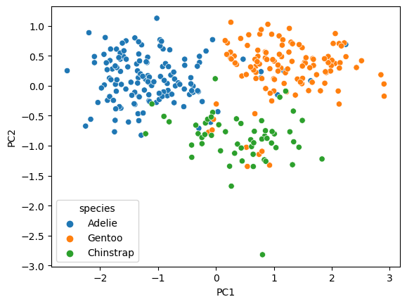
✅ Do this: What are the PC coordinates for the first data point (index 0)? Which quadrant would this point be drawn in?
# Your answer here
The PC’s can be thought of as how far along their associated line the point would be projected. Here’s one way to draw all the projections.
sns.scatterplot(data = penguins_subset2,
                x = 'bill_length_mm',
                y = 'flipper_length_mm',
                hue = penguins.species)


# Show points projected onto the 1st PC line
X1 = penguins_pca.PC1*pca.components_[0,0]
Y1 = penguins_pca.PC1*pca.components_[0,1]

plt.scatter(X1,Y1, marker = '+', color = 'violet')


# Show points projected onto the 2st PC line
X2 = penguins_pca.PC2*pca.components_[1,0]
Y2 = penguins_pca.PC2*pca.components_[1,1]

plt.scatter(X2,Y2, marker = 'o', color = 'pink')
plt.axis('square')
(-2.4261469084390352,
 3.105364257468495,
 -2.2932134979887167,
 3.238297667918814)
Below is code that emphasizes the projected points.
✅ Do this: the value of index below is just picking out a different point in our data set. Mess around with this number. How do the X and star points move around as you change index?
sns.scatterplot(data = penguins_subset2,
                x = 'bill_length_mm',
                y = 'flipper_length_mm',
                hue = penguins.species)
plt.axis('square')

for i, (comp, var) in enumerate(zip(pca.components_, pca.explained_variance_)):
    slope = comp[1]/comp[0]
    plt.plot(np.array([-2,2]), slope*np.array([-2,2]))

#===========
# Emphasize one point and its projections
#===========

index = 300 #<---------- play with this!

# Here's one data point
plt.scatter([penguins_subset2.iloc[index,0]],
            [penguins_subset2.iloc[index,1]],
            marker = 'D', color = 'black', s = 100, label = 'Data pt')

# Here's the projection of that point on PC1 (X shape)
plt.scatter([X1[index]], [Y1[index]],
           marker = 'X', color = 'purple', s = 100, label = 'Project: PC1')

# And here's the projection of that point on PC2 (star)
plt.scatter([X2[index]], [Y2[index]],
           marker = '*', color = 'purple', s = 100, label = 'Project: PC2')

plt.legend()
<matplotlib.legend.Legend at 0x16a257bd0>
Everything we just did is great for understanding what the PCA is doing, but in reality, we’re usually going to be looking at the data in the transformed space.
✅ Do this: Make a scatter plot of PC1 and PC2. Color the points by penguins.species. What do you notice about how the points have moved from the (bill, flipper) scatter plot?
# Your code here
Penguins PCA with all columns#
We used only two columns above for visualization, but we can instead use all the input columns to run our PCA.
penguins_num.head()
| bill_length_mm | bill_depth_mm | flipper_length_mm | body_mass_g | year | |
|---|---|---|---|---|---|
| 0 | 39.1 | 18.7 | 181.0 | 3750.0 | 2007 |
| 1 | 39.5 | 17.4 | 186.0 | 3800.0 | 2007 |
| 2 | 40.3 | 18.0 | 195.0 | 3250.0 | 2007 |
| 4 | 36.7 | 19.3 | 193.0 | 3450.0 | 2007 |
| 5 | 39.3 | 20.6 | 190.0 | 3650.0 | 2007 |
pca = PCA(n_components=4)
penguins_pca_all = pca.fit_transform(penguins_num)
penguins_pca_all = pd.DataFrame(data = penguins_pca_all,
                                columns = ['PC1', 'PC2', 'PC3', 'PC4'])
penguins_pca_all
| PC1 | PC2 | PC3 | PC4 | |
|---|---|---|---|---|
| 0 | -457.325096 | -13.376298 | 1.247904 | -0.376474 |
| 1 | -407.252228 | -9.205245 | -0.032667 | -1.090217 |
| 2 | -957.044699 | 8.128321 | -2.491467 | 0.720823 |
| 3 | -757.115824 | 1.838910 | -4.880569 | 2.073668 |
| 4 | -557.177325 | -3.416994 | -1.129267 | 2.629297 |
| ... | ... | ... | ... | ... |
| 328 | -206.895442 | 12.507424 | 9.424523 | 2.201716 |
| 329 | -806.944216 | 13.443905 | -1.490242 | 1.436737 |
| 330 | -432.103210 | 0.999033 | 7.386135 | -0.375741 |
| 331 | -106.881363 | 12.241310 | 3.792123 | 2.298703 |
| 332 | -432.025413 | 5.863210 | 6.502283 | 0.676175 |
333 rows × 4 columns
✅ Do this: Make a scatter plot of PC1 and PC2 using this new model, and again color the points by penguins.species. What do you notice about how the PC plot has changed from the previous setting?
# your code here
Congratulations, we’re done!#
Initially created by Dr. Liz Munch, modified by Dr. Lianzhang Bao and Dr. Firas Khasawneh,Michigan State University

This work is licensed under a Creative Commons Attribution-NonCommercial 4.0 International License.