Homework 4: Working with data using Pandas and Fitting data with a model#
✅ Put your name here.#

Image credit: https://www.lifegate.com/people/news/climate-change-wine-production
Goals#
The main goals of this homework are
Extracting information from datasets
Cleaning data with
pandasVisualizing data with
seabornFitting data using
curve_fit
To achieve these goals we will be using two different datasets; grape_harvest.csv and stars.csv
Assignment instructions#
Work through the following assignment, making sure to follow all of the directions and answer all of the questions.
This assignment is due at 11:59pm on Friday, Mar 29. It should be uploaded into the “Homework Assignments” submission folder for Homework #4. Submission instructions can be found at the end of the notebook.
Full disclosure: The first two parts of this exam were created in collaboration with a professor in horticulture with an interest in wine and I am an expert in neither!
Grading#
Exploring the grape harvest data (25 points)
1.1 Loading and inspecting the data (5 points)
1.2 Determining the earliest and latest harvest dates and where they occurred (5 points)
1.3 Finding median harvest dates in 50 year intervals (4 points)
1.4 Visualizing trends by region (11 points)
Stars: Exploratory Data Analysis (17 points)
2.1 Loading and inspecting the data (2 points)
2.2 Looking for correlations (2 points)
2.3 Grouping by (3 points)
2.4 Visual representation of correlations (10 points)
Fitting curves to data: (16 points)
3.1 Choosing a model (6 points)
3.2 Fit the model (7 points)
3.3 Check your model (3 points)
Total: 58 points
Part 1: Exploring the grape harvest data (25 points total)#
1.1: Loading and inspecting the data (5 points)#
After visiting Traverse City and sampling Michigan wines, you decide that you would like to start a vineyard in Michigan. You’ve seen the vineyards in Traverse City and know that, although it is possible to grow wine grapes there, that sometimes it is too cold. You wonder if because of climate change, Michigan might soon have a warmer, more suitable climate for growing grapes.
You know that Europe has a long history of growing grapes, and you wonder if they kept records that might indicate how grapes respond to changes in temperature. You find a study that has compiled numerous records of grape harvest dates for more than four centuries and also a database of temperature anomalies in Europe dating back to 1655.
Using the provided dataset, grape_harvest.csv, you’re going to explore how the European grape harvest date changes with respect to temperature across centuries of data.
import matplotlib.pyplot as plt
%matplotlib inline
import numpy as np
import pandas as pd
import seaborn as sns

from scipy.optimize import curve_fit
✅ Task: (2 points) Read in the grape harvest data file as a pandas dataframe and display the first 10 rows
# Read in the grape harvest data here
✅ Task: (4 points) Now, write some code to inspect some of the properties of the data and then answer the following questions:
Use a command to look at summary statistics (like the count, min, max, and mean) for columns with continuous data
What are the names of the columns?
How many rows are in this dataset?
How many different (or
unique) regions are in the dataset
# Put your code here
Put your answer here
1.2: Determining the earliest and latest harvest dates and where they occurred (5 points)#
The pandas dataframe you just created should have four columns, which are:
‘year’: the year the data was collected
‘region’: the region in Europe that the data was collected from
‘harvest’: the harvest date recorded. Harvest date is defined as number of days after August 31st. A negative number means the grapes were harvested before August 31st that year, and a positive number after.
‘anomaly’: the temperature anomaly. For a given year, this number represents how much colder (negative) or hotter (positive) Europe was compared to a long term reference value, in degrees Celsius
We’ll start off our exploration of grape harvest dates by figuring out when and where the earliest and latest harvest dates occurred.
✅ Task: (5 points) Below, print out statements answering the following questions using masking techniques that you have learned:
Which year did the earliest harvest happen, which region did it occur in, and how early was the harvest?
Which year did the latest harvest happen, which region did it occur in, and how late was the harvest?
# Put your code here
1.3 Finding median harvest dates in 50 year intervals (4 points)#
You want to know if the grape harvest date is changing, and if so, is it getting earlier or later?
You decide that you would like to know the median grape harvest date for the following 50 year intervals, as well as the median since the year 2000:
1800-1849
1850-1899
1900-1949
1950-1999
2000-2007
✅ Task: For each of the above intervals, calculate the median grape harvest date. For each interval print out statements saying
"The median harvest date for years (*insert interval here*) is: x".
Is the harvest date for grapes getting earlier or later?
# Put your code here
Put your answer here
1.4 Visualizing trends by region (11 points)#
Now that you understand a bit about the overall trends in the data, you want to examine other factors that might influence grape harvest date besides historical changes in climate.
You see that the data comes from many regions, all the way from sunny Spain to Germany. You wonder if these latitudinal differences would have any effect on the grape harvest dates.
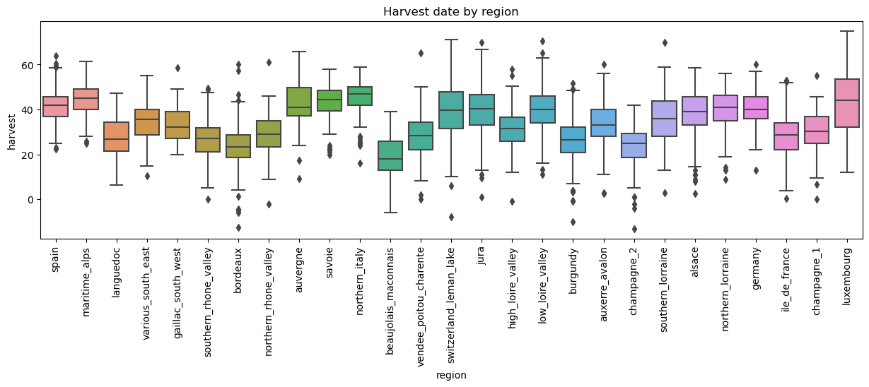
✅ Task: (5 points) Make a boxplot comparing the ditributions of grape harvest dates where the x-axis is “region” and the y-axis “harvest”. The regions will be ordered by latitude, from the most southern to northern. This will allow you to assess visually if latitude is affecting grape harvest date.
Your plot should:
have a figure of size (15, 4)
include axis labels
have a title
the \(x\) axis ticks should be rotated by 90 degrees
finally, arrange the regions by latitude, from the most southern to the most northern. To do this, use the provided list
latitude_order. Withinseabornboxplot function, specify theorderargument as follows:order = latitude_order. This will arrange the regions in your boxplot from the most southern to northern.
Hint: Here is the link to boxplot’s documentation. You want to get a plot like this
## DO NOT DELETE THE PROVIDED LINES OF CODE

# list of regions,  ordered from the most southern to most northern
latitude_order = ['spain','maritime_alps','languedoc','various_south_east',
                  'gaillac_south_west','southern_rhone_valley','bordeaux',
                  'northern_rhone_valley','auvergne','savoie','northern_italy',
                  'beaujolais_maconnais','vendee_poitou_charente','switzerland_leman_lake',
                  'jura','high_loire_valley','low_loire_valley','burgundy','auxerre_avalon',
                  'champagne_2','southern_lorraine','alsace','northern_lorraine',
                  'germany','ile_de_france','champagne_1','luxembourg']

# Put your code here
✅ Question: (6 points) Based on your graph, answer these questions:
What do the black diamonds represent?
do you believe that latitude affects the harvest date? Explain your reasoning.
If harvest date changes going south to north, how does this impact your analysis of the effect of history and climate change on harvest date? If harvest date is not affected by latitude, what are the implications for your analysis then?
Put your response here
Part 2: Stars: Exploratory Data Analysis (17 total points)#
The first step in every data science project, after obtaining the dataset, is called Exploratory Data Analysis (EDA). As the name suggest it consists in exploring your acquired dataset and look for correlations. In the following you are given a dataset containing information about stars. You don’t need to know astronomy for this homework and so in the following you will be guided through some steps of a mini data science project.
2.1: Read in the data (2 points)#
Use
pandasto read the csv file with stars’ data,stars.csv, and save it into a dataframe calledstars_data. (1 point)Print data for the last 15 stars (1 point)
# Put your code here
The dataset contains information on 240 stars. The columns are
Temperature (K): Absolute temperature of the star measured in Kelvin
Luminosity (L/Lo): Luminosity of the star relative to the luminosity of the sun \(L_o = 3.828 \times 10^{26}\) Watts (Avg Luminosity of Sun)
Radius (R/Ro): Radius of the star relative to the radius of the sun \(R_o = 6.9551 \times 10^8\) m (Avg Radius of Sun)
Absolute Magnitude (Mv): Absolute Magnitude
Star type: Type of star. This is a limited dataset with only 6 types = “Red Dwarf”, “Brown Dwarf”, “White Dwarf”, “Main Sequence”, “Super Giants”, “Hyper Giants”
Star color: Color of the star
Spectral Class: Classification of stars
2.2 Looking for correlations (2 points)#
As you can see there are four columns with numerical values and three columns with string values. Obviously, we can look for correlations only on the first four columns.
✅ Task (1 point): Print a correlation matrix of the first four columns. Hint: Look up the corr function of dataframes.
# Put your code here
✅ Question (1 point): Do you notice any high correlation between columns?
✎ Put your answer here
2.3 Grouping by (3 points)#
The last three columns of the dataset are there for a reason. Each star is assigned to a class based on its properties.
✅ Task (1 point): Run the following cell and explain what you see.
stars_data.groupby(by = "Star type").corr(numeric_only=True)
✅ Task (2 points):
Explain what you see
Do you notice any difference from the original correlation matrix you printed above?
✎ Put your answer here
2.4: Visual representation of correlations (10 points)#
The numbers above gives us a quantitative measure of the correlations in the dataset. As you can see Temperature, Luminosity, and Radius become more or less correlated depending on the type of star. In this part we want to visualize the correlations and in the next part we want to model them.
Visualization in data science is a very important skill!!! The main issue that we see is that we have 7 columns in our dataset, but normal plots can only show two of them at the time. However, there are ways to show three or four columns of data at the same time. (More than four is still possible, however, that plot might be confusing to understand.)
The way to plot three columns of data at once is to use the x-axis, y-axis, and a color axis. You have done this before, so let’s do it again. The x-axis and y-axis will contain numerical values, while the color axis will be used for the type of star.
We want to make a plot similar to this one

✅ Task (6 points): Use matplotlib and/or seaborn to make one figure containing two scatter plots like the ones above. Each plot has the following characteristic
The entire figure should be 12 inches wide and 6 inches tall (1 point).
Temperature or Radius on the \(x\) -axis and Luminosity on the \(y\) -axis (1 point)
Make both the \(x\) and \(y\) axis log scaled (1 point).
Label the \(x\)-axis as Temperature (K) and the \(y\)-axis as Luminosity (L/Lo) (1 point)
Color the stars based on their star type and label with correct star type. (1 point).
Show the legend (1 point).
Side Notes
The above plot on the left is called the Hertzprung-Russell diagram. For details as to what the Hertzsprung-Russel Diagram is, you can take a look here. Basically, this is a plot that helps astronomers understand how stars evolve. Over time, individual stars will track out a path on this diagram and when looked at for a whole group of stars, we can use this plot to estimate how old that population of stars might be. If you were to compare your plot with any of the HR diagrams on the internet you would notice that your plot is flipped! This is because the Temperature increases towards the left in those plots!!! You can fix this by adding this line at the end of your code.
plt.gca().invert_xaxis()You can choose any color scheme you want as long as it clearly differentiate the type of stars. That means do not make the Red and Brown dwarfs similar color, otherwise you can’t differentiate them. The color scheme used in the example plot is given below, if you want to use it.
# These colors are a personal choice of one of the instructors.
# You don't have to choose this, you can choose any color scheme you want.
# If you are interested in knowing more about this color scheme Google "Okabe-Ito color palette"
scolor = ["#CC79A7", "#D55E00", "#0072B2", "#F0E442", "#009E73", "#56B4E9", "#E69F00","#000000"]


# Put your code here
✅ Questions: (4 points) Looking at the plots,
What are the stars whose Luminosity is highly correlated with Temperature and Radius? (1 point)
Now that you’ve looked at the two plots, which of the two plots suggested that astronomers use the names: “Red Dwarf”, “Brown Dwarf”, “White Dwarf”, “Main Sequence”, “Super Giants”, “Hyper Giants”? (1 point)
Looking at the main sequence stars. Which plot has the largest slope? Justify your answer and look carefully at the range of values the data span. (2 points)
✎ Put your answer here
Part 3: Fitting curves to data. The Luminosity Function (16 points)#
Now that we have visualized our data we can formulate our question.
What is the relation between Luminosity, Temperature, and Radius?
In the following we will try to find this relation.
3.1: Choosing a model (6 points)#
In the above plots we notice that the main sequence stars fall on a (almost) straight line in both plots. Since both axis are on a log-log plot we can infer that there exist a power-law relation between the Luminosity, \(L\), Temperature, \(T\) and radius, \(R\). Specifically,
For the sake of simplicity, we will try to model only the relation between Luminosity and Temperature. In order to simplify the above equation we look at the description of our data. Notice that the Luminosity is a relative quantity, i.e. we have information of the ratio between the real luminosity divided (normalized) by the luminosity of the sun, \(L_o = 3.828 \times 10^{26}\). Therefore, it would be better to compare the relative luminosity with the relative temperature. The relation now becomes
where \(T_o = 5780\) K is the temperature of the sun.
✅ Task (6 points):
Add a new column to your dataset and call it
Normalized Temperature. This column is obtained by dividing theTemperature (K)column by the temperature of the sun \(T_o = 5780\) K. (2 points)Write a function called
lum_modelthat computes the relative luminosity according to the equation above (i.e. \(\left( \frac{T}{T_o} \right )^{\beta}\)). Remember, you now have a new column that is the normalized temperature, \(\frac{T}{T_0}\), so this simplifies your function and you don’t need to worry about doing the normalization inside the function if you give it the right temperature data. (4 points)
# Put your code here
3.2: Fit the model (7 points)#
✅ Task:
Now use
curve_fitwith the above function to find the parameter \(\beta\) by fitting theLuminosity(L/Lo)andNormalized Temperatureof the main sequence stars only (you’ll want to use a mask to select these stars).What is the value of \(\beta\)?
# Put your code here
3.3 Check your model (3 points)#
✅ Task (3 points): Make a plot comparing your model and the data. Don’t forget to log-scale your axis, label them, and add a legend.
# Put your code here
Congratulations, you’re done!#
Submit this assignment by uploading it to the course Desire2Learn web page. Go to the “Homework Assignments” folder, find the submission link for Homework 4, and upload it there.
© 2023 Copyright the Department of Computational Mathematics, Science and Engineering.