Day 7 In-class Assignment: Exploring Great Lakes Water Levels using NumPy#
✅ Put your name here
#✅ Put names of your group members
#In today’s activity, were going to use numpy and matplotlib to interact with some data that pertains to the water levels of the Great Lakes.
In recent years there have been some rapid changes in Great Lakes water levels that have led to flooding. It has also driven speculation that such changes are driven by extreme precipitation events brought on by climate change.

Today we will examine over 100 years of water level measurements for each Great Lake, using data collected by the National Oceanic and Atmospheric Administration (NOAA). You can find this dataset here: https://www.glerl.noaa.gov/data/wlevels/#observations. This also gives us an opportunity to practice working with numpy arrays and matplotlib!
Learning Goals:#
By the end of this assignment you should be able to:
Load data using NumPy so that you can visualize it using matplotlib
Work with NumPy “array” objects to compute simple statistics using built-in NumPy functions.
Use NumPy and matplotlib to look for correlation in data
Part 1: Using NumPy to explore the water level history of the Great Lakes#
# Although there are some exceptions, it is generally a good idea to keep all of your
# imports in one place so that you can easily manage them. Doing so also makes it easy
# to copy all of them at once and paste them into a new notebook you are starting.

# Bring in NumPy and Matplotlib
import numpy as np
import matplotlib.pyplot as plt
To use this notebook for your in-class assignment, you will need these files:
lake_michigan_huron.csvlake_superior.csvlake_erie.csvlake_ontario.csv
These files are supplied along with this notebook on the course website. You will read data from those files and it is important that the files are in the same place as the Jupyter notebook on your computer. Work with other members of your group to be sure everyone knows where the files are.
Take a moment to look at the contents of these files with an editor on your computer. For example,
*.csvfiles open with Excel or, even better, look at it with a simple text editor like NotePad or TextEdit or just try opening it inside your Jupyter Notebook interface.
As you saw in the pre-class assignment, you can use the command below to load in the data.
# use NumPy to read data from a csv file
# second, better example of loadtxt()
mhu_date, mhu_level = np.loadtxt("lake_michigan_huron.csv", usecols = [0,1], unpack=True, delimiter=',') # example for the lake_michigan_huron.csv file
Once you have your data, it is always a good idea to look at some of it to be sure it is what you think it is. You could use a print statement, or just type the variable name in an empty cell.
mhu_date
✅ What do you think this data represents?
✎ Put your answer here
✅ Next, write some code in this cell to read the data from the other files. Use descriptive variable names to store the results.
# Read in data from the remaining files.

# Print some of the values coming in from the files to ensure they look fine.
✅ Question: Before you move on, what is the variable type of the lake data you’ve loaded? Use the type() function to check on the mhu_date and mhu_level variables. Does this match your expectations?
✎ Put your answer here
Part 2: Descriptive Statistics of Data Sets#
✅ Now that you have read in the data, use NumPy’s statistics operations from the pre-class to compare various properties of the water levels for all of the lakes.
mean
median
standard deviation
2.1 Means and Medians#
What is the mean of a data set?
The mean, also referred to as the average, is calculated by adding up all of the observations in a data set, and dividing by the number of observations in the data set.
where \(N\) = number of observations, \(x_i\) = an observation. More simply put,
The mean of a data set is useful because it provides a single number to describe a dataset that can be very large. However, the mean is sensitive to outliers (observations that are far from the mean), so it is best suited for data sets where the observations are close together.
What is the median of a data set?
The median of a data set is the middle value of a data set, or the value that divides the data set into two halves. The median also requires the data to be sorted from least to greatest. If the number of observations is odd, then the median is the middle value of the data set. If the number of observations is even, then the median is the average of the two middle numbers.
Unlike the mean, because the median is the midpoint of a data set, it is not strongly affected by a small number of outliers.
Using numpy to Calculate Mean and Median#
We can calculate the mean and median from scratch, but we are going to introduce one option for functions in Python that will do the calculations for you. Because the calculations of mean and median are so useful, many Python packages include a function to calculate them, but here we are going to use the calculations from numpy.
The documentation for numpy mean shows additional options, but the basic use is:
np.mean(data)
Similarly, the median is calculated by:
np.median(data)
In the cell below, calculate the mean and median of the water level for each of the four lakes using the numpy functions.
# Put your code here
2.2 Calculating Standard Deviation#
One way to describe the distribution of a data set is the standard deviation. The standard deviation is the square root of the variance of the data. The variance is a measure of how “spread out” the distribution of the data is. More specifically, it is the squared difference between a single observation in a data set from the mean. The standard deviation is often represented with the greek symbol sigma (\(\sigma\)).
Mathematically, the equation for standard deivation is:
$\( \sigma = \sqrt{\frac{\sum\limits_{i=1}^{N} (x_{i}-\mu)^2}{N}} \)$#
where the symbols in this equation represent the following:
\(\sigma\): Standard Deviation
\(\mu\): Mean
\(N\): Number of observations
\(x_{i}\): the value of dataset at position \(i\)
Similarly to np.mean() and np.median(), we can calculate the standard deviation and percentiles with numpy as follows:
np.std(data)
In the cell below, calculate the standard deviation of the water level for each of the four lakes using the numpy function.
# put your code here
2.3 Visualizing the Data with matplotlib#
✅ Now, let’s see what is in the files by plotting the second column versus the first column using matplotlib. This means that the second column should go on the y-axis and the first column should go on the x-axis.
Do this for all of the files.
This is our first example of doing some (very simple!) data science - looking at some real data. As a reminder, the data came from here; if you ever find data like this in the real world, you could build a notebook like this one to examine it. In fact, your projects at the end of the semester might be much larger versions of this.
# plot the water levels here
Plots like this are not very useful. If you showed them to someone else they would have no idea what is in them. In fact, if you looked at them next week, you wouldn’t remember what is in them. Let’s use a little more matplotlib to make them of professional quality. There are two things that every plot should have: labels on each axis. And, there are many other options:
✅ First, remake separate figures for each of the datasets you read in and include in the plots: \(x\)-axis labels, \(y\)-axis labels, grid lines, markers, and a title.
✅ Then, make all of them in the same plot using the same formating techniques you used in the separate plots but also add a legend.
We are not going to tell you how to do this directly! But, we’re here to help you to figure it out. If you find yourself waiting for help from an instructor, you can also try using Google to answer your questions. Searching the internet for coding tips and tricks is a very common practice!
The Python community also provides helpful resources: they have created a comprehensive gallery of just about any plot you can think of with an example and the code that goes with it. That gallery is here and you should be able to find many examples of how to make your plots look professional. (You just might want to bookmark that webpage…..)
# Put your code here to make each plot separately. You might need to create multiple notebook cells or use "subplot"
# Make sure they are professionaly constructed using all of the options above.
# Make another plot here with all the data in the same plot and include a legend
# It still might not be super useful, but at least with a legend you can tell which line is which!
✅ What observations about the data do you have? Are the lake levels higher or lower than they have been in the past? Put your answer here:
✎ In the data I see….
Part 3: Looking for correlations in data (Time Permitting)#
In the plots you have made so far you have plotted water levels versus time. This is fairly intuitive and corresponds to the way the data was given to us. Next, we are going to do something a little more abstract to seek correlations in the data, a standard goal in data science. As you have seen, there are a lot of fluctuations in the data - what do they tell us? For example, do the levels go up at certain times of year? In certain years that had more rain? Can we see evidence of global warming? While we won’t answer these questions at this point, we can look for patterns across the lakes to see if the fluctations in levels might correspond to trends. To do this, we will plot the level of one lake versus the level of another lake (we will not plot either level against time). Note that we somewhat lose the time information because we aren’t using that array anymore.
✅ In the cell below, plot the level of one lake versus the level of another lake (time should not be involved in your plot command) - do this for several combinations. Put them in separate cells if you need to - otherwise each will be in the same plot, which might be less useful. (If you’re feeling comfortable using subplot feel free to use that.)
# add your plots here (with labels, titles, legend, grid)
# what line type should you use? what are the best markers to use?
# next lake here, and so on.....
✅ In this cell, write your observations. What do you observe about the lake levels?
✎ I observed…..
3.2 Pearson Correlation Coefficient with np.corrcoef()#
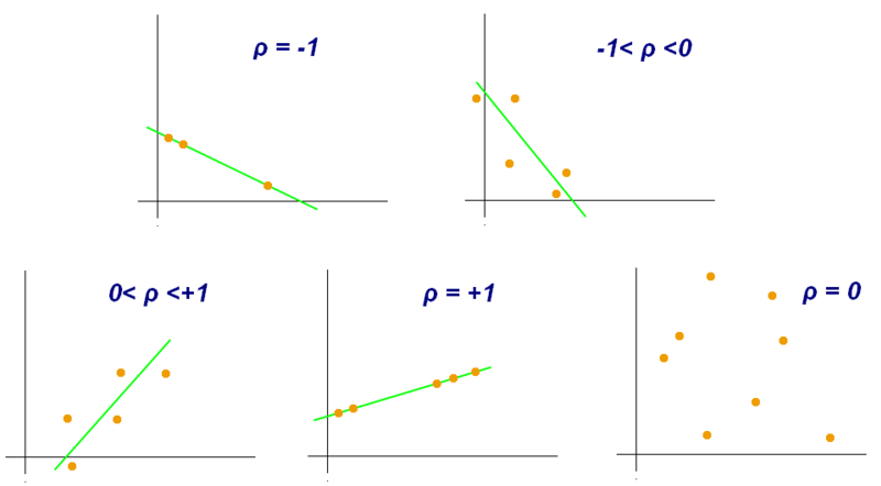
Now that you have made some qualitative observations of the water levels, we are going to explore how to quantify those observations. There are many ways to measure correlation, but we are going to use the Pearson Correlation Coefficient (also referred to as “r”, “\(\rho\)”, or “correlation coefficient”). The Pearson Correlation Coefficient ranges from -1 to 1 and provides a measure of how dependent on one another your variables are.
If the correlation coefficient is close to 1 or -1, then the correlation is strong, if it is close to zero, the correlation is weak. If the the correlation coefficient is negative, then the y values decrease as x increases. If the correlation coefficient is positive, then the y values increase as x increases. See the image below for a visualization of this!
 .
.
Using np.corrcoef()#
To calculate the correlation coefficient, we are going to use another numpy function, np.corrcoef. To use np.corrcoef(), you will call it with your x and y variables like this:
np.corrcoef(x,y)
It will return all of the possible correlation coefficients (including the data with itself) as an array.
✅ In the cell(s) below, choose two of the plots you made in the beginning of Part 3 and calculate the correlation coefficient on the data from each plot. Were there any differences between your qualitative observations and your quantitative calculations?
# put your code here
✎ I observed…..
ASIDE: Saving Plots#
Finally, you will need to use your plots for something. In your other classes and labs you often will need to make plots for your assignments and lab reports - now is the time to start using Python for that! Modify the code above to write the plot into a file in PNG format. Here are a couple of examples for how you can save files as a PNG file and as a PDF file:
plt.savefig('foo.png')
plt.savefig('foo.pdf')
Put your name in the filename so that we can keep track of your work.
Congratulations, you’re done!#
Submit this assignment by uploading it to the course Desire2Learn web page. Go to the “In-class assignments” folder, find the appropriate submission folder, and upload it there. Make sure to upload your plot images as well!
If the rest of your group is still working, help them out and show them some of the things you learned!
See you next class!
© Copyright 2023, The Department of Computational Mathematics, Science and Engineering at Michigan State University