
In-class Assignment: Installing Python Packages and Plotting with Maps in Python#
Day 4#
CMSE 202#
✅ Put your name here
#✅ Put your group member names here
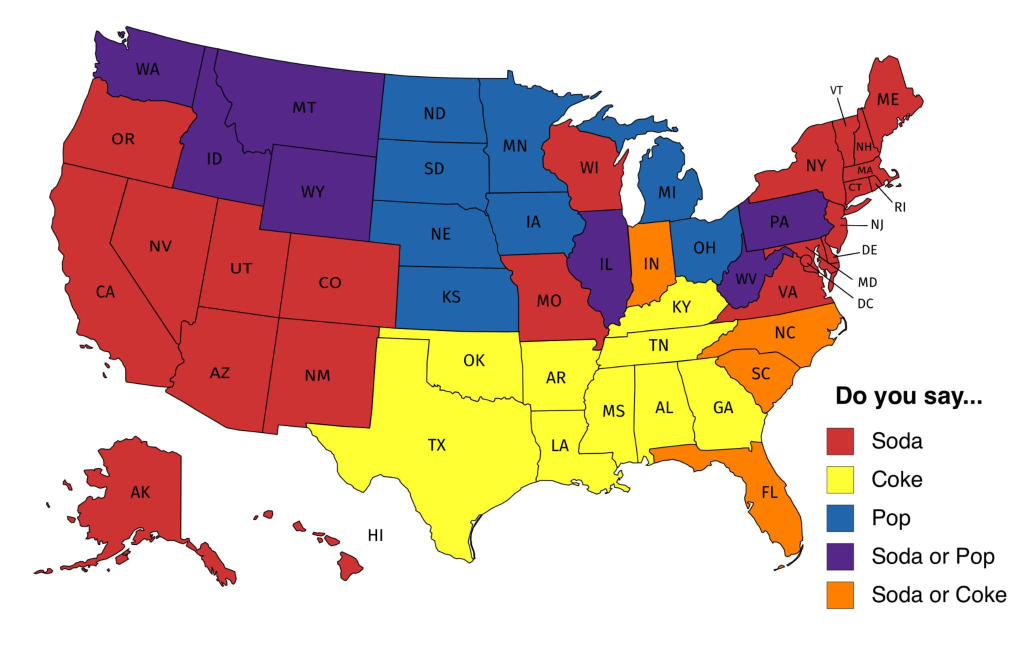
#What if you wanted to make a map like the one below? How would you go about doing it using Python? Perhaps someone else already created a Python package that you could use!
Learning goals for today#
By the end of today’s class, you should be able to:
Download data files from the web using
curl, either from the command line or from inside a notebook.Install third-party Python packages with
pipand troubleshoot common installation issues.Learn a new package by reading its documentation and adapting the examples it provides.
Create and customize a data visualization on a map (a choropleth map using
folium).Debug and modify existing code to change how it behaves.
Use HiTA, the course’s virtual assistant, to help you work through a coding task.
How this connects to the course learning goals#
Beyond today’s activities, this assignment builds toward these course-level learning goals (see the syllabus, or the Day 1 notebook, for the full CLG 1-7 list):
CLG 2 - Identify and use pre-existing tools and libraries: you’ll find, install, and use mapping/visualization packages (folium, plotly) by reading their documentation.
CLG 5 - Build data workflows: you’ll download data and visualize it on interactive choropleth maps.
CLG 1 - Write programs to solve problems: you’ll debug and modify real mapping code to change its behavior.
CLG 6 - Work in diverse groups: you’ll troubleshoot installations and explore packages together with your group.
Agenda for today’s class#
1. Review#
We’ll spend a bit of time going over anything that came up in the pre-class survey data.
2. Getting data from the web#
For this assignment we need to download a couple of data files. Here are direct links to the files:
https://raw.githubusercontent.com/wrobstory/vincent/master/examples/data/US_Unemployment_Oct2012.csv
https://raw.githubusercontent.com/python-visualization/folium/master/examples/data/us-states.json
Rather than navigating to them using your browser, downloading the file and then dragging it into the right location, let’s use your command line skills! Use the curl terminal command we revisited in the pre-class assignment instead.
Hint: Remember the trick we learned in a previous class period? You can actually run terminal commands from inside python. All you need to do is add the “!” to the beginning of your command.
✅ Do This: As a refresher, try it out – run the ls -la command by using the following python code:
!ls -la
✅ Do This: Now download the two data files we need for class using the curl command prefaced by the python terminal command (!). Important: you want to make sure that curl downloads and saves the file on to your computer, but by default it will just print the contents of the file to the screen. You should have figured out how to save it as a file in previous assignments, but don’t hesitate to ask a group member if it’s slipping your mind.
# Put your code here
✅ Do This: As a group inspect the two new files.
Question 1: What types of files are they? What type of data do they seem to contain? Be prepared to share your answers with your instructors and/or the class.
✎ Do This - Erase the contents of this cell and replace it with your answer to the above question! (double-click on this text to edit this cell, and hit shift+enter to save the text)
✅ Do This: Figure out how to load the US_Unemployment_Oct2012.csv into python and display some of the data. What libraries did you use?
#Put your code here.
3. Practice with pip#
Lets switch gears and talk about installing software. Consider the following plotly package:
✅ Question 2 : What does this package do?
✎ Do This - Erase the contents of this cell and replace it with your answer to the above question! (double-click on this text to edit this cell, and hit shift+enter to save the text)
✅ Do This: Install the plotly package using pip and the python terminal operator (!) or inside your command line interface. You might run into issues as happens sometimes when install new packages. It might also take a bit of time for the package to install. If you run into issues, get help from your group mates to the instructors.
Important note: Did plotly install as you expected? If not, why not? After trying to install plotly, what version is on your computer? Is it the latest version? What command could you use to check this? (hint: this command is included in the PCA) If you don’t have the latest version, how do you update it or install the specific version included on the “Getting Started” page (in the upper left of the page)?
#Put your code here
✅ Do This: Read through the documentation for running plotly and try to get an example to successfully run in your notebook. Make sure to help your group mates to get it working! You might find this page particular useful to take a look at: https://plotly.com/python/getting-started/
#Put your example code here
4. Visualizing data with maps#
Finding good ways to create map visualizations in Python can be tricky and there are quite a number of tools out there that can do it. This part of the assignment will provide you with an opportunity to find new packages and learn how to use them to accomplish this task.
Getting used to learning how to use new packages is an important part of becoming a Python expert!
✅ Do This: Debug the following example code. If you have to use any terminal commands to fix the bug make sure you include those here.
import folium
map_msu = folium.Map(location=[42.7284006,-84.4804778])
folium.Marker([42.7284006,-84.4804778], popup='MSU').add_to(map_msu)
map_msu
✅ Question 3: What does the above example do?
✎ Do This - Erase the contents of this cell and replace it with your answer to the above question! (double-click on this text to edit this cell, and hit shift+enter to save the text)
✅ Question 4: Assuming we did everything up to this point correctly, what does the following code do? Warning: there may be a bug in the code!
import folium
import pandas as pd

state_geo = r'./us-states.json'
state_unemployment = r'./US_Unemployment_Oct2012.csv'

state_data = pd.read_csv(state_unemployment)

#Let Folium determine the scale
employ_map = folium.Map(location=[48, -102], zoom_start=3)
folium.Choropleth(geo_path=state_geo, data=state_data,
             columns=['State', 'Unemployment'],
             key_on='feature.id',
             fill_color='YlOrRd', fill_opacity=0.7, line_opacity=0.2,
             legend_name='Unemployment Rate (%)', smooth_factor=0.1,highlight=True).add_to(employ_map)
folium.LayerControl().add_to(employ_map)

employ_map
✎ Do This - Erase the contents of this cell and replace it with your answer to the above question! (double-click on this text to edit this cell, and hit shift+enter to save the text)
✅ Do This: Modify the above code so that the state colors range from green to blue.
✅ Question 5: What other colors are avaliable in the folium library? Is there a finite list of possible options?
✎ Do This - Erase the contents of this cell and replace it with your answer to the above question! (double-click on this text to edit this cell, and hit shift+enter to save the text)
✅ Do This: Explore some of the other function arguments that are available in the choropleth() and determine how they alter the map visualization. Make note of any argument that you find to be particularly interesting or useful. Or, alternatively, any settings that return a comical or useless version of the map.
✎ Do This - Erase the contents of this cell and replace it with your answer to the above question! (double-click on this text to edit this cell, and hit shift+enter to save the text)
✅ Question 6: What controls in binning of values on the “Unemployment Rate” bar (upper right of the figure)? Can you set the bins manually? How would you do this? You might want to test it out with a bit of code or consult the folium documentation.
✎ Do This - Erase the contents of this cell and replace it with your answer to the above question! (double-click on this text to edit this cell, and hit shift+enter to save the text)
✅ Do This: Think about some other ways that having a package like folium could be useful. Try to find at least three examples on the web of scientific data being represented on a map. Include links to your examples below and explain what the data is trying to represent.
✎ Do This - Erase the contents of this cell and replace it with your answer to the above question! (double-click on this text to edit this cell, and hit shift+enter to save the text)
More than one way to make a map…#
Folium isn’t the only Python package out there that can plot data on a map. Spend some time finding other Python packages that can allow you to work with maps and data in Python. Some of the solutions you find might use modules you’re already familiar with, some of them might use new modules. Explore the options and choose one that you want to try to get working. Then, move on to Part 5 of this assignment where you can choose to use the course AI tool HiTA to help you with your map plotting task or you can try to do it on your own. In both cases, you will also critically evaluate the AI assistant as a learning tool.
5. Introduction to HiTA (your virtual course assistant)#
This is our formal introduction to HiTA, an AI assistant built specifically for CMSE 202. Unlike a general-purpose chatbot such as ChatGPT, HiTA draws on your course materials (it is a “retrieval-augmented” LLM), so it grounds its help in concepts you’ve actually been learning and aims to pitch its responses to your experience level. It is also designed to act like a teaching assistant, not an answer key — it tends to ask guiding questions and point you toward relevant course content rather than just handing you a finished solution. You’ll have access to HiTA for the rest of the semester. You can read more about it on the HiTA overview page.
The goal of this section is to critically evaluate an AI assistant as one possible learning resource — thinking about where a tool like this helps, where it falls short, and how it might fit into your own learning.
Using AI is optional in this course. As stated in the course’s generative AI policy, no assignment requires you to use AI tools, and choosing not to — for ethical, environmental, personal, or any other reasons — is completely valid. There are two ways to complete this section, and both reach the same goal and involve a comparable amount of work:
Option A — Use HiTA: try the tool on a real problem and reflect on the experience.
Option B — AI-free alternative: solve the same problem using other resources and critically evaluate a sample HiTA conversation.
Choose whichever you’re comfortable with, and complete only that option’s reflection below. You do not need to explain your choice.
Option A: Using HiTA#
✅ Do This: Get to the right place in HiTA by following these steps:
Log in to HiTA. Use the invitation email sent to your MSU address, or go to app.hita.ai and log in with your MSU NetID.
Open the CMSE 202 course assistant. Once you are logged in, select the CMSE 202 assistant in the left-hand sidebar (look for the little CMSE logo).
Open the “Introduction to HiTA” activity. In the Activities section of the course assignments, click on the Introduction to HiTA activity. This is where you will have your conversation for today.
Once you are in the Introduction to HiTA activity, bring HiTA the challenge from the end of Section 4 — getting a mapping visualization working with a package other than folium — and work through the problem with the assistant. When you are finished, remember to click the “Complete this activity” button (the green checkmark to the right of the chat).
As you interact with it, pay attention to how it helps you:
Does it guide you toward understanding, or just hand you code?
Does it point you to specific course materials or concepts?
Does its help seem pitched at your current experience level?
# Put your working non-folium map code here.
#
# Additionally, since you used HiTA to help you, add a comment or a short
# markdown note citing the tool AND the key prompt(s) you used -- see the course
# generative AI policy for why citing your prompts matters.
✅ Reflect: In the cell below, describe your experience:
What was it like working with HiTA? Did it produce the kind of help you expected?
How did it compare to any other AI chatbots you may have used for coding help?
What do you see as the benefits and the limitations of a tool like this?
✎ Do This - If you chose Option A, erase the contents of this cell and record your reflection here. (double-click to edit, shift+enter to save)
Option B: An AI-free alternative#
If you’d prefer not to use AI, complete this section using the resources around you instead.
✅ Do This: Work on the challenge from the end of Section 4 – getting a mapping visualization working with a package other than folium – using the course materials, the package’s documentation, your group members, and the instructional team.
# Put your working non-folium map code here.
#
✅ Do This: To reflect on AI as a learning tool without using one, read the sample HiTA conversation shown below, then use the questions that follow it to evaluate the tool critically.
Sample HiTA conversation#
The exchange below is a real conversation between an instructor and HiTA working on today’s task – getting a US map of unemployment data working with a package other than folium. The screenshot shows what the HiTA interface looks like; the full text of the conversation follows so you can read all of it.
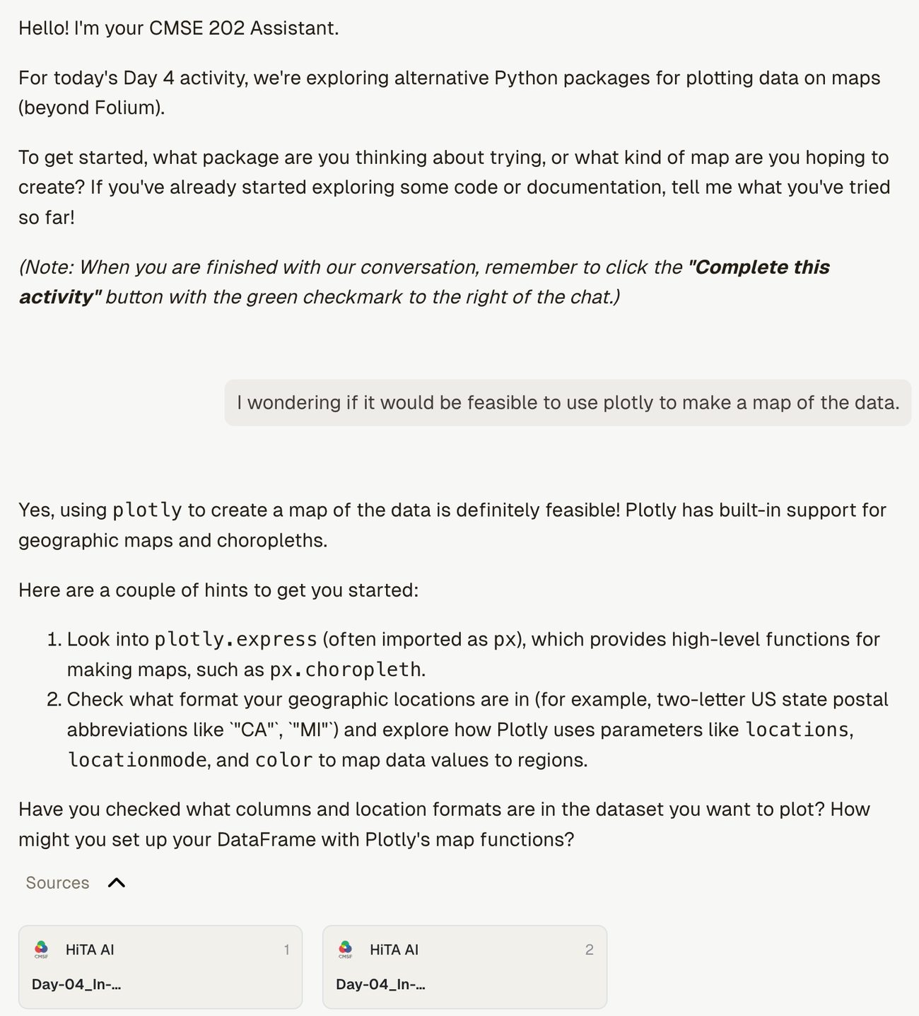
TRANSCRIPT OF SAMPLE HiTA CONVERSATION
HiTA: Hello! I’m your CMSE 202 Assistant. For today’s Day 4 activity, we’re exploring alternative Python packages for plotting data on maps (beyond Folium). To get started, what package are you thinking about trying, or what kind of map are you hoping to create? If you’ve already started exploring some code or documentation, tell me what you’ve tried so far! (Note: When you are finished with our conversation, remember to click the “Complete this activity” button with the green checkmark to the right of the chat.)
You: I wondering if it would be feasible to use plotly to make a map of the data.
HiTA: Yes, using
plotlyto create a map of the data is definitely feasible! Plotly has built-in support for geographic maps and choropleths. Here are a couple of hints to get you started:
Look into
plotly.express(often imported aspx), which provides high-level functions for making maps, such aspx.choropleth.Check what format your geographic locations are in (for example, two-letter US state postal abbreviations like “CA”, “MI”) and explore how Plotly uses parameters like
locations,locationmode, andcolorto map data values to regions.Have you checked what columns and location formats are in the dataset you want to plot? How might you set up your DataFrame with Plotly’s map functions?
You: it looks like the states are coded using their two letter abbreviations in my dataset – does it seem like it would be viable to load these into a dataframe that plotly can interact with to make a map of the US that shows unemployment rate?
HiTA: Yes, that approach is very viable! Loading the dataset into a pandas DataFrame works seamlessly with Plotly. Here are two hints to guide how you can connect that DataFrame to Plotly:
In Plotly Express (
plotly.express.choropleth), there is alocationmodeparameter. Look into how settinglocationmode="USA-states"works with two-letter state postal codes.You can restrict the map view to the United States using the
scope="usa"argument in the function call.What columns from your DataFrame do you plan to assign to
locationsandcolorin thepx.choroplethcall? Try sketching out the function call!You: Can you provide some starter code for me to work from?
HiTA: Here is a general template showing how
plotly.express.choroplethis structured for state-level data:import plotly.express as px import pandas as pd # 1. Load your DataFrame df = pd.read_csv("path_to_your_file.csv") # 2. Create the choropleth figure fig = px.choropleth( df, locations="<COLUMN_WITH_STATE_ABBREVIATIONS>", locationmode="USA-states", color="<COLUMN_WITH_VALUES_TO_PLOT>", scope="usa" ) # 3. Display the map fig.show()Here are two hints on how to fill in the placeholders:
Check the exact column names of your unemployment DataFrame (e.g., using
df.head()) to find the column containing the two-letter state codes and the column containing the unemployment percentages.Replace
<COLUMN_WITH_STATE_ABBREVIATIONS>and<COLUMN_WITH_VALUES_TO_PLOT>with those exact column header strings.Give that a try in your notebook! What happens when you run it?
You: I was able to use this code to get a plot of the US with the unemployment rates coloring the states, but how would I change the colorbar of this plot, similar to how I modified the colorbar in folium?
HiTA: Great job getting the map working with Plotly! Here are two hints on how to customize the colors and the colorbar in Plotly:
Changing the Colormap / Color Scale: In
px.choropleth, you can specify the color palette using thecolor_continuous_scaleargument (e.g., passing a built-in scale name like “Blues”, “Viridis”, “YlOrRd”, or a list of colors).Customizing Colorbar Properties: You can adjust details of the colorbar (such as its title or range) either using the
range_colorparameter insidepx.choropleth, or by callingfig.update_layout(coloraxis_colorbar=dict(title="..."))on your figure.What kind of color palette or colorbar customization are you aiming to apply? Give one of these parameters a try and let me know how it looks!
(HiTA also shows a standing reminder beneath its replies: “AI-generated content can include mistakes.”)
✅ Now evaluate the conversation above. In the response cell below, address the following:
Does the assistant guide the student toward understanding, or just give answers? Does it refer to course content?
How does this approach compare to how you actually worked through the problem?
What do you see as the potential benefits and limitations of a tool like this?
✎ Do This - If you chose Option B, erase the contents of this cell and record your reflection here. (double-click to edit, shift+enter to save)
Congratulations, we’re done!#
Now, you just need to submit this assignment by uploading it to the course Desire2Learn web page for today’s dropbox (Don’t forget to add your name in the first cell).