Day 20 Pre-class Assignment: Introduction to Data Visualization#
✅ Your name here
#Goals for Today’s Pre-Class Assignment#
By the end of this assignment, you should be able to:
Understand the best practices of data visualization
Understand what types of graphs are available and when to use them
Understand how to choose the right data visualization tools
Understand how to interact critically with datasets
Assignment instructions#
In today’s assignment we’ll be developing our ability to make effective plots. The most important lesson that we want you to come away with is:
Plots are visual stories. A good plot conveys a message that is both convincing and easy to understand.#
1. Exploring Best Practices of Data Visualization#
Broadly, a visualization is a visual representation of information or data. Good visualizations are able to tell a story and are interpretable for a wide audience. In this section, we will identify technical aspects of visualizations that help make visualizations easy to understand.
Below are three examples of data visualizations.

Looking at the three visualizations above and answer the following questions in the markdown below:
Which plot is the easiest to read?
What features of the plots make it them easy to interpret or challenging to interpret?
Pick one plot and make a claim about what the plot is showing.
✎ Put your answer here
What makes a good graph?#
Below is a non-comprehensive list of aspects that help make a plot readable and interpretable. It is important to note that while there are some universal concepts for making good visualizations, there are also stylistic choices that are dependent on different schools of thought and no one style is completely better than the other. Here are some combined guidelines from Edward Tufte, Albert Cairo, Catherine D’Ignazio and Lauren F. Klein.
A good graph/visualization:
Tells a story
Data doesn’t speak for itself
Lets people extract conclusions from the data
Complex ideas are communicated with clarity, precision, and efficiency
Gives the viewer the greatest number of ideas in the shortest amount of time by using the least ink and space
Multivariate (show mulitple variables)
Tells the truth about the data
The representation of numbers should be directly proportional to the numerical quantities represented (scaling by the area of shapes can be accidentally misleading if done incorrectly).
Clear, detailed, and thorough labeling should be used to defeat distortion and ambiguity.
Label important events in the data.
The number of dimensions represented should not exceed the number of dimensions in the data
Do not quote data out of context.
Using the guidelines above, pick two of the three plots above to compare with the guidelines. What guidelines do they meet? What guidelines do they not meet? What would you change about the plot do that it does meet the guidelines?
✎ Put your answer here
2. Ethics in Data Visualization#
As good data scientists (or, really, anyone who works with data) we should always strive to be eithical in our work. This is especially true when we want to visualize our data. There are several approaches or frameworks for how researchers think about presenting and visualizing data. Some influential individuals in this field include Alberto Cairo, Edward Tufte, and Catherine D’Ignazio and Lauren F. Klein. (You might remember you read an excerpt from D’Ignazio and Klein for the Day 12 PCA.)
In some ways, there is some tension between the approaches of Tufte, Cairo, and D’Ignazio and Klein in the way they suggest presenting data. Some quotes from each are presented below. After reading each quote, compare and contrast their viewpoints. Then, discuss how you want to integrate these viewpoints into your practice.
From Edward Tufte: |
|---|
“Graphical excellence is the well-designed presentation of interesting data - a matter of substance, of statistics, and of design. Graphical excellence consists of complex ideas communicated with clarity, precision, and efficiency. Graphical excellence is that which gives to the viewer the greatest number of ideas in the shortest time with the least ink in the smallest space. Graphical excellence is nearly always multivariate. And graphical excellence requires telling the truth about the data.” |
“Computers and their affiliated apparatus can do powerful things graphically, in part by turning out the hundreds of plots necessary for good data analysis. But at least a few computer graphics only evoke the response, ‘Isn’t it remarkable that the computer can be programmed to draw like that?’ instead of “My, what interesting data.’” |
From Alberto Cairo: |
|---|
“A good graphic realizes two basic goals: It presents information, and it allows users to explore that information. In other words, an information graphic is a tool for the designer to communicate with readers, and a tool for readers to analyze whatâs being presented to them.” |
“The purpose of infographics and data visualizations is to enlighten peopleânot to entertain them, not to sell them products, services, or ideas, but to inform them. Itâs as simpleâand as complicatedâas that.â |
From D’Ignazio and Klein: |
|---|
“Rather than valorizing the neutrality ideal and trying to expunge all human traces from a data product because of their bias, feminist philosophers have proposed a goal of more complete knowledge…Itâs not just data visualization but all forms of knowledge that are situated…meaning that they are produced by specific people in specific circumstancesâcultural, historical, and geographic…Each personâs intersecting subject positions are unique, and when applied to data science, they can generate creative and wholly new research questions.” |
“Rather than making universal rules and ratios (think: data-ink [from Tufte]) that exclude some aspects of human experience in favor of others, our time is better spent working toward a more holistic and more inclusive ideal. All design fields, including visualization and data communication, are fields of possibilities.” |
✅ ✎ Compare and contrast the three approaches here
✅ ✎ Discuss how you want to integrate these viewpoints into your practice here
3. Choosing the Right Tools for the Job#
3.1 Picking a type of plot#
Now that you have a basic understanding of some of the best practices when it comes to data visualization, you’re probably wondering how to put these principles into practice. One important factor to consider is choosing the right type of graph for your data. Cairo has some good advice to get started (pg. 124-125):
Think about the task or tasks you want to enable, or the message that you wish to convey. Do you want to compare, to see change or flow, to reveal relationships or connections, to envision temporal or spatial patterns and trends? We could summarize this point with a sentance that sound tautological, but isn’t: plot what you need to plot. And if you don’t know what it is that you need to plot yet, plot many features of your data until the stories they may hide rise up.
Try different graphic forms. If you have more than one task on your wish list, you may need to represent your data in several ways.
Arrange the components of the graphic so as to make it as wasy as possible to extract meaning from it. Whenever it’s appropriate, add interactivity to your visualization so people can organize the data at will.
Test the outcomes yourself and with people who are representative of your audience - even if it is in a non-scientific, non-systematic manner.
With this in mind, let’s explore some of the many types of graphs.
✅ Explore The Data Visualization Catalogue and the From Data to Viz project. Are there any types of graphs that stand out to you? Are there any that might be useful in your semester project? Pick one and describe how it represents data. When would be a good time to use it?#
Put your answer here
3.2 Some Notes When Dealing with Datasets#
Making nice visualizations out of your data is important, but the real focus is on the data itself. Not all datasets come in nicely wrapped packages; sometimes you need to put in a lot of work to get it into a format that can be visualized. Part of that formatting is understanding the data itself. Make sure to read the documentation/header/description when you download the data and understand what the creator meant by each column title; this might be different than what you interpret the titles to mean, and it can have significant effects on the results your visualizations show.
Once you understand the data, it’s time to get it in shape. There are three main categories to this process: binning, filtering, and smoothing.
Binning - This refers to grouping the data into different sections. An example could be grouping states by region (ie Midwest, Northeast, South, Central) if you had a data on the 50 states.
Filtering - This refers to creating subsets of data. A large dataset may include columns that isn’t of any use to the project you’re working on. In order to make it more manageable, it’s totally fine to get rid of it by filtering that portion out. pandas is a great tool for this kind of data manipulation.
Smoothing - This refers to getting rid of noise - statistical variance - in your data. Examples of this include calculating averages or fitting curves to show the behavior of certain variables.
✅ When might you need to engage in these processes? Give an example for each category. Would one (or more) of these processes be useful in your semester project?#
Put your answer here.
4. Introducing Seaborn#
Seaborn is an excellent package for making more sophisticated plots. Seaborn has many built-in features, and many of the default parameters are set up in an aesthetically pleasing way. There is also an extensive gallery of examples.
4.0 How does Seaborn handle data?#
When exploring Seaborn documentation, you may notice that it handles data differently than you have seen before! For exploration purposes, Seaborn actually has some default datasets that you can load directly with the Seaborn load_dataset() function. These default datasets are actually Pandas dataframes that come with Seaborn. How do we know what these datasets are and how to access them?
Run the code below to import seaborn (this is a new import command!) and then display the names of available datasets.
import seaborn as sns # import Seaborn

sns.get_dataset_names() # display all of the names of the built-in datasets that Seaborn has
['anagrams',
 'anscombe',
 'attention',
 'brain_networks',
 'car_crashes',
 'diamonds',
 'dots',
 'dowjones',
 'exercise',
 'flights',
 'fmri',
 'geyser',
 'glue',
 'healthexp',
 'iris',
 'mpg',
 'penguins',
 'planets',
 'seaice',
 'taxis',
 'tips',
 'titanic',
 'anagrams',
 'anagrams',
 'anscombe',
 'anscombe',
 'attention',
 'attention',
 'brain_networks',
 'brain_networks',
 'car_crashes',
 'car_crashes',
 'diamonds',
 'diamonds',
 'dots',
 'dots',
 'dowjones',
 'dowjones',
 'exercise',
 'exercise',
 'flights',
 'flights',
 'fmri',
 'fmri',
 'geyser',
 'geyser',
 'glue',
 'glue',
 'healthexp',
 'healthexp',
 'iris',
 'iris',
 'mpg',
 'mpg',
 'penguins',
 'penguins',
 'planets',
 'planets',
 'seaice',
 'seaice',
 'taxis',
 'taxis',
 'tips',
 'tips',
 'titanic',
 'titanic',
 'anagrams',
 'anscombe',
 'attention',
 'brain_networks',
 'car_crashes',
 'diamonds',
 'dots',
 'dowjones',
 'exercise',
 'flights',
 'fmri',
 'geyser',
 'glue',
 'healthexp',
 'iris',
 'mpg',
 'penguins',
 'planets',
 'seaice',
 'taxis',
 'tips',
 'titanic']
Now that you know the names of the default datasets you can use to explore what Seaborn can do, let’s use one as an example (we’ll use “mpg”)!
Run the code in the cells below. The first loads the dataset and the second creates a figure using Seaborn.
sns.set_theme(style="white") # sets the visual theme for Seaborn

mpg = sns.load_dataset("mpg") # loads the 'mpg' default dataset

mpg.head()
| mpg | cylinders | displacement | horsepower | weight | acceleration | model_year | origin | name | |
|---|---|---|---|---|---|---|---|---|---|
| 0 | 18.0 | 8 | 307.0 | 130.0 | 3504 | 12.0 | 70 | usa | chevrolet chevelle malibu |
| 1 | 15.0 | 8 | 350.0 | 165.0 | 3693 | 11.5 | 70 | usa | buick skylark 320 |
| 2 | 18.0 | 8 | 318.0 | 150.0 | 3436 | 11.0 | 70 | usa | plymouth satellite |
| 3 | 16.0 | 8 | 304.0 | 150.0 | 3433 | 12.0 | 70 | usa | amc rebel sst |
| 4 | 17.0 | 8 | 302.0 | 140.0 | 3449 | 10.5 | 70 | usa | ford torino |
# Plots some of the data using Seaborn's relplot function!
sns.relplot(x="horsepower", y="mpg", hue="origin", size="weight",
           sizes=(40, 400), alpha=.5, palette="muted",
           height=6, data=mpg)
<seaborn.axisgrid.FacetGrid at 0x105aa6710>
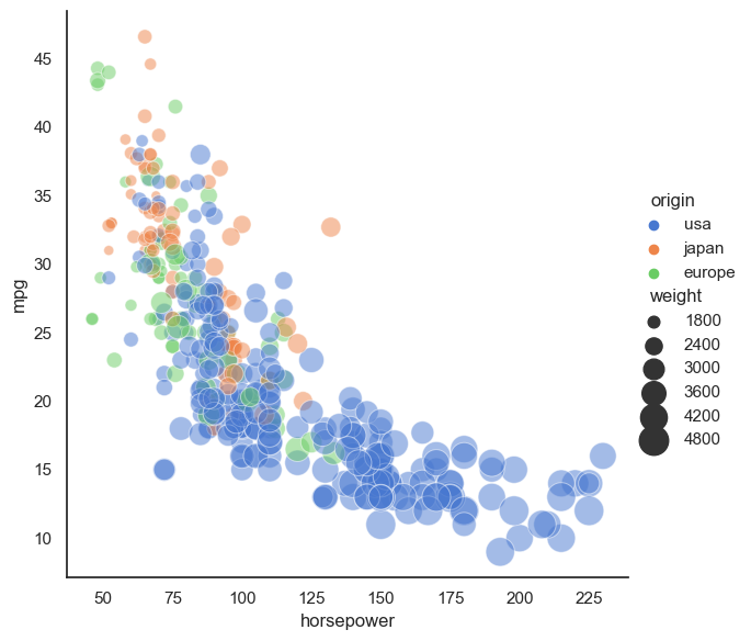
✅ 4.1 What stands out to you? What do you think the story of this figure is?#
Write down what you think the story being told in this plot?
✅ 4.2 Now, go through the Seaborn example gallery and try to create one of the plots they present.#
#Write your code for the Seaborn plot here
✅ 4.3 What do you think the story is for the plot you made?#
Write down what you think the story being told in this plot?
5. Making your Figure for In-Class#
For the upcoming in-class assignment, you will be working with your group to create the best plot possible (based on the measures discussed above).
✅ 5.1 Use materials from Day 12 (Data Contexting and Wrangling) and Day 13 (Finding Resources Online) or data you might have found for your semester project to create a plot!#
You can use Seaborn or Matplotlib, and you should put your plot in a slide, which you will present to your group in class.
NOTE: If you are using Seaborn, you will need to load your data into a Pandas dataframe and then you can use Seaborn plotting functions with your dataframe as the data input in the plotting function.
### AN EXAMPLE WITH SEABORN AND NON-DEFAULT DATA ###
import pandas as pd
my_dataframe = pd.read_csv('this_is_cool_data.csv')

sns.relplot(x="my_x_column_name", y="my_y_column_name", hue="a_different_column_name", size="another_column_name",
            sizes=(40, 400), alpha=.5, palette="muted",
            height=6, data=my_dataframe)
✅ 5.1.1 Before you make your plot, recall that the context of your data is critical for understanding what claims you can make from your plot.#
In the cell below, answer the following Data Context questions from Day 12 to generate your data context statement:
Who collected/generated the data?
How was the data collected/generated?
Who/what is included in the data?
Who/what is not included in the data?
What are the limitations or biases of the data?
NOTE: You will be expected to share this context statement with your group in class (and potentially with the rest of the class).
✅ 5.1.2 In the cell below, write the code you need to make your plot.#
# Write code for making your plot here using whatever dataset you chose
Assignment wrap-up#
Please fill out the form that appears when you run the code below. You must completely fill this out in order to receive credit for the assignment!
from IPython.display import HTML
HTML(
"""
<iframe
	src="https://cmse.msu.edu/cmse201-pc-survey"
	width="800px"
	height="600px"
	frameborder="0"
	marginheight="0"
	marginwidth="0">
	Loading...
</iframe>
"""
)
Congratulations, you’re done!#
Original content for this assignment was created by Alexa Gordon#
Sources#
The Truthful Art: Data, Charts, and Maps for Communication by Alberto Cairo
The Visual Display of Quantitative Information by Edward Tufte
CMSE 402 assignments
Other links throughout the assignment
Copyright © 2025, Department of Computational Mathematics, Science and Engineering at Michigan State University, All rights reserved.